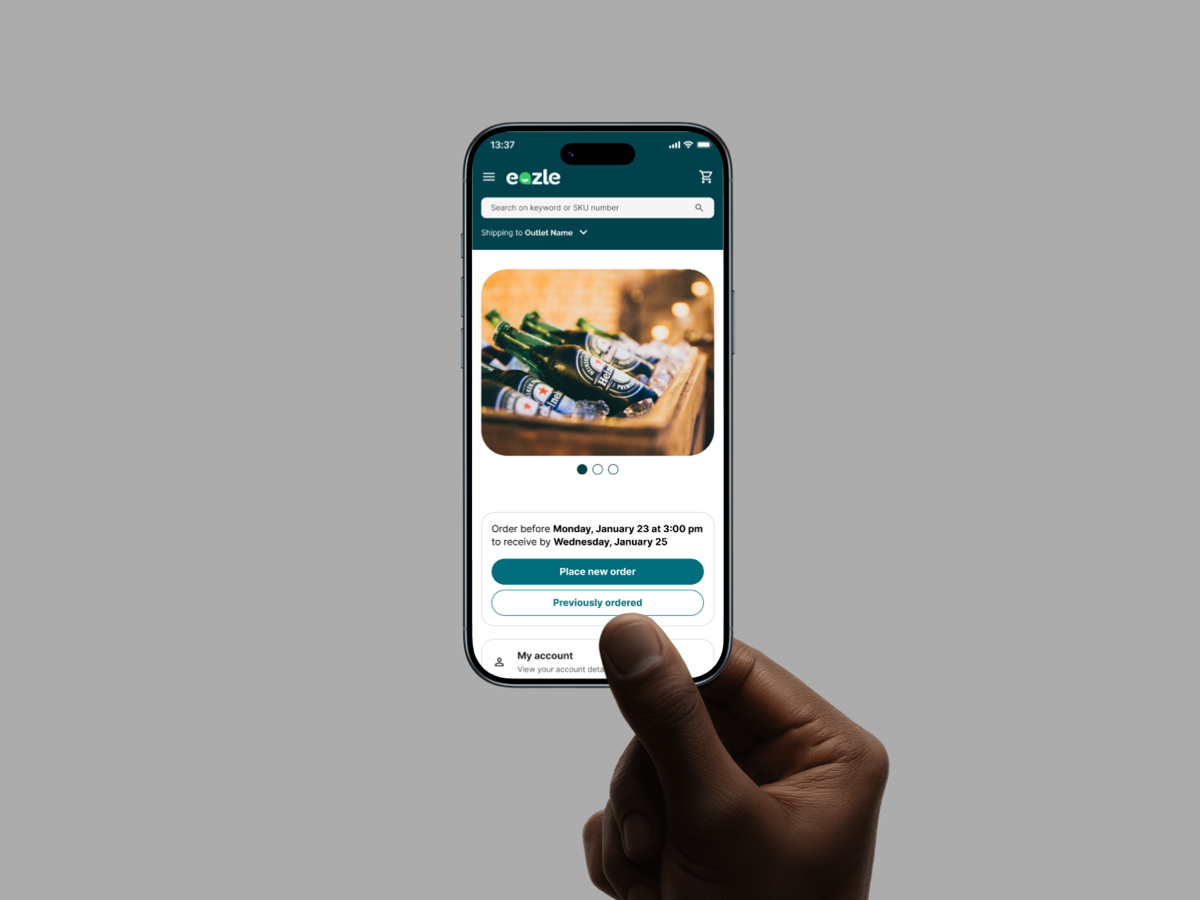
Case study · Experiencegift
Experiencegift Design System
Building digital foundations for a multi-brand design system
Client is ExperiencegiftRole is Product designerIndustry is Gifting · Multi-brandTimeline is Apr – Aug 2026
Digital foundations and tokens that let four gift brands share one accessible design system.
- Design systems
- Design tokens
- Multi-brand theming
- Accessibility
- UI audit

Overview
Following a company rebrand, I worked on establishing the digital foundations for the design system used across the Experiencegift product ecosystem. While the new brand identity was well defined for physical products such as gift cards and packaging, many aspects of the digital experience were not fully specified.
The goal of this project was to translate the updated brand into a scalable set of digital foundations that could support multiple products and brands while ensuring consistency, accessibility, and ease of implementation.
Context
Experiencegift operates several brands under one umbrella product ecosystem, including Hotelgift, Flightgift, Traingift, and Activitygift. Although these brands share the same platform and product infrastructure, each has its own visual identity.
This required a design system that could support both shared product experiences and brand-specific theming, allowing teams to build consistently while maintaining the individuality of each brand.
- Hotelgift — Gift cards for hotel stays
- Flightgift — Gift cards for flights
- Traingift — Gift cards for train travel
- Activitygift — Gift cards for activities
The problem
The rebrand provided clear guidance for physical brand applications but left many digital foundations undefined. As a result, product teams lacked a consistent framework for implementing the brand in UI.
- 01
Incomplete digital color palettes
- 02
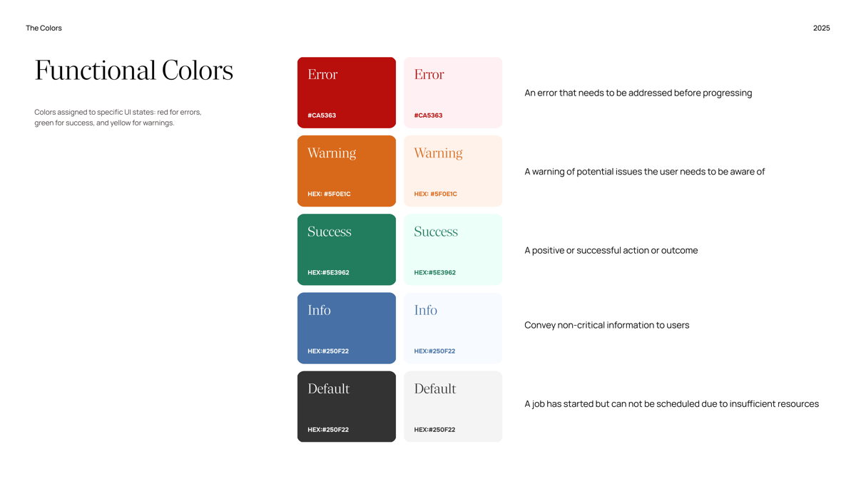
Missing system and semantic colors for UI states
- 03
Inconsistent use of typography and spacing
- 04
Accessibility standards not consistently met
- 05
Lack of structure for implementing the brand across multiple products
This created friction for both designers and developers and made it difficult to scale the product consistently across brands.
My role
I was responsible for defining and structuring the core digital foundations for the design system. This included establishing color, typography, and spacing foundations and translating brand guidelines into a system that could be used consistently in digital products.
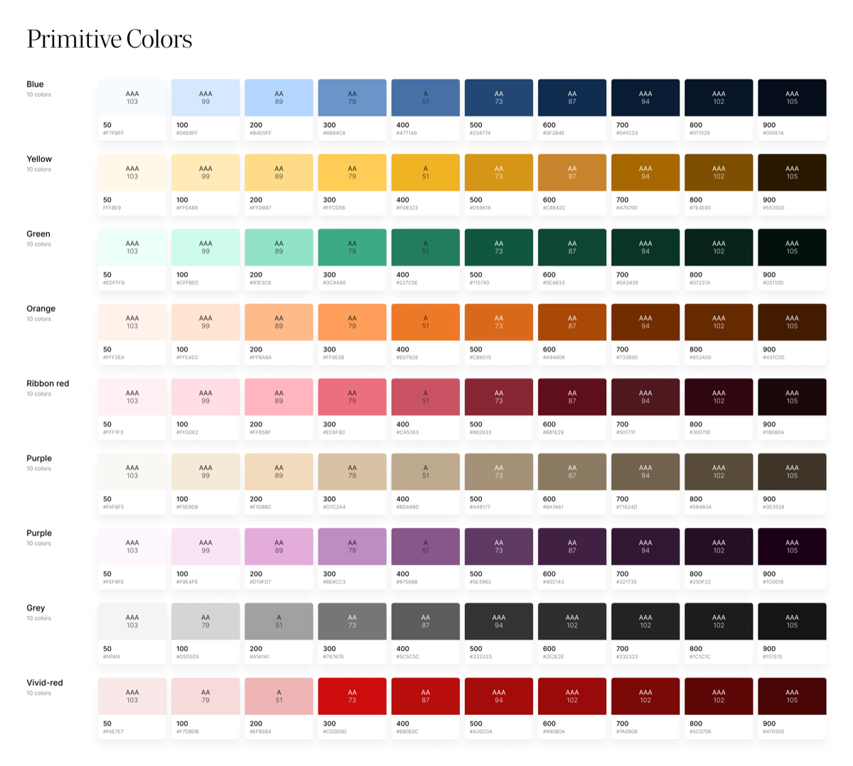
As part of this work, I defined both primitive and semantic token collections, creating a clear structure that separated base design values from their contextual usage in the interface. This approach allowed the system to remain flexible while supporting multiple brands and product experiences.
Key responsibilities
- 01
Defining color foundations
- 02
Structuring typography system
- 03
Establishing spacing hierarchy
- 04
Creating token architecture
- 05
Ensuring accessibility compliance
Approach
To address the gaps in the existing system, I started by auditing current product interfaces to identify inconsistencies in color usage, spacing, and typography. This helped reveal where brand guidelines were unclear or where digital implementations diverged across products.
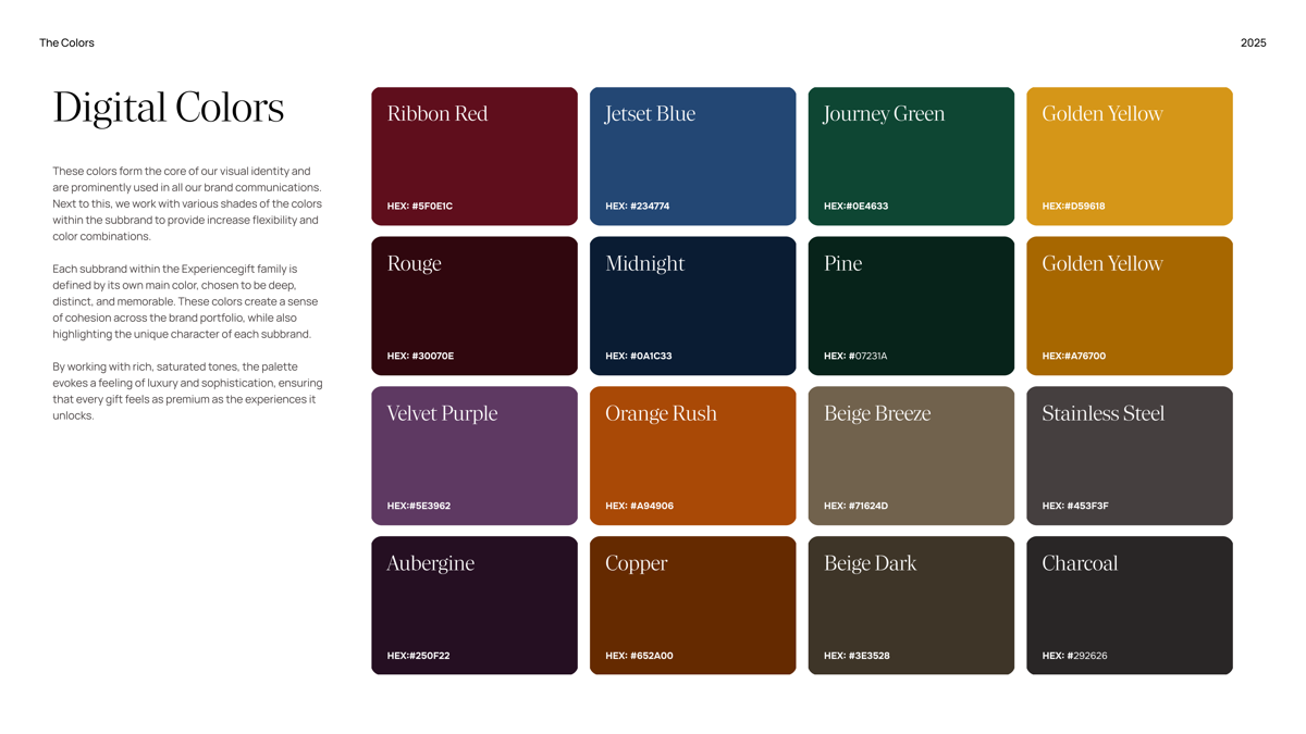
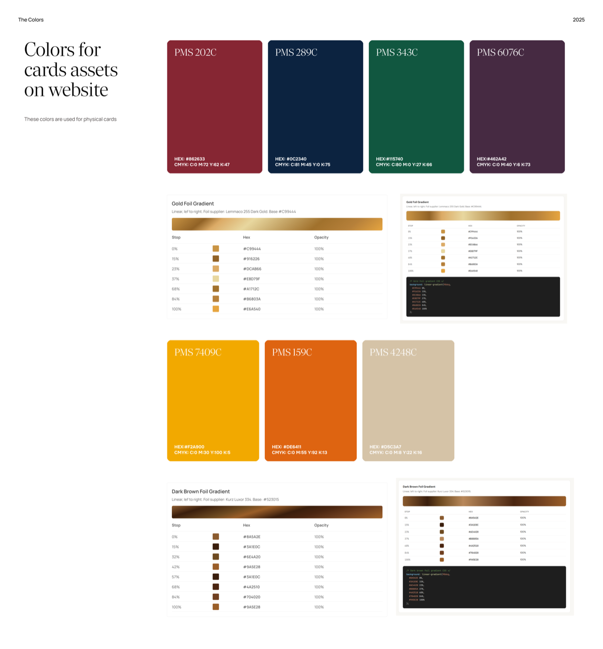
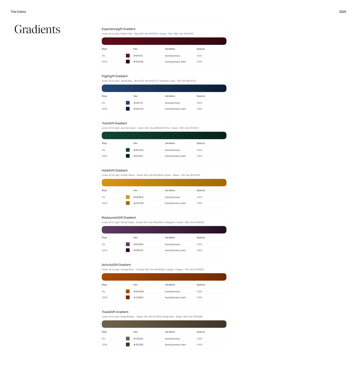
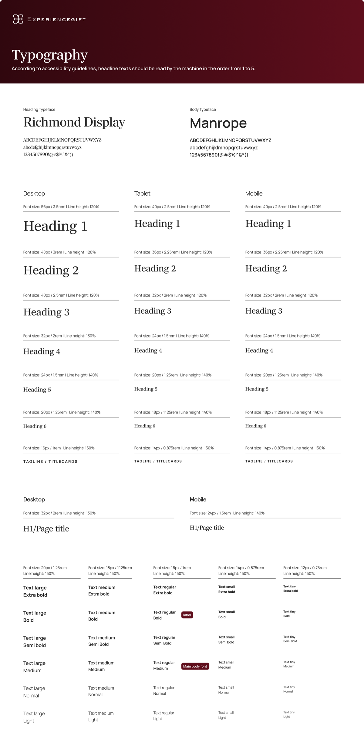
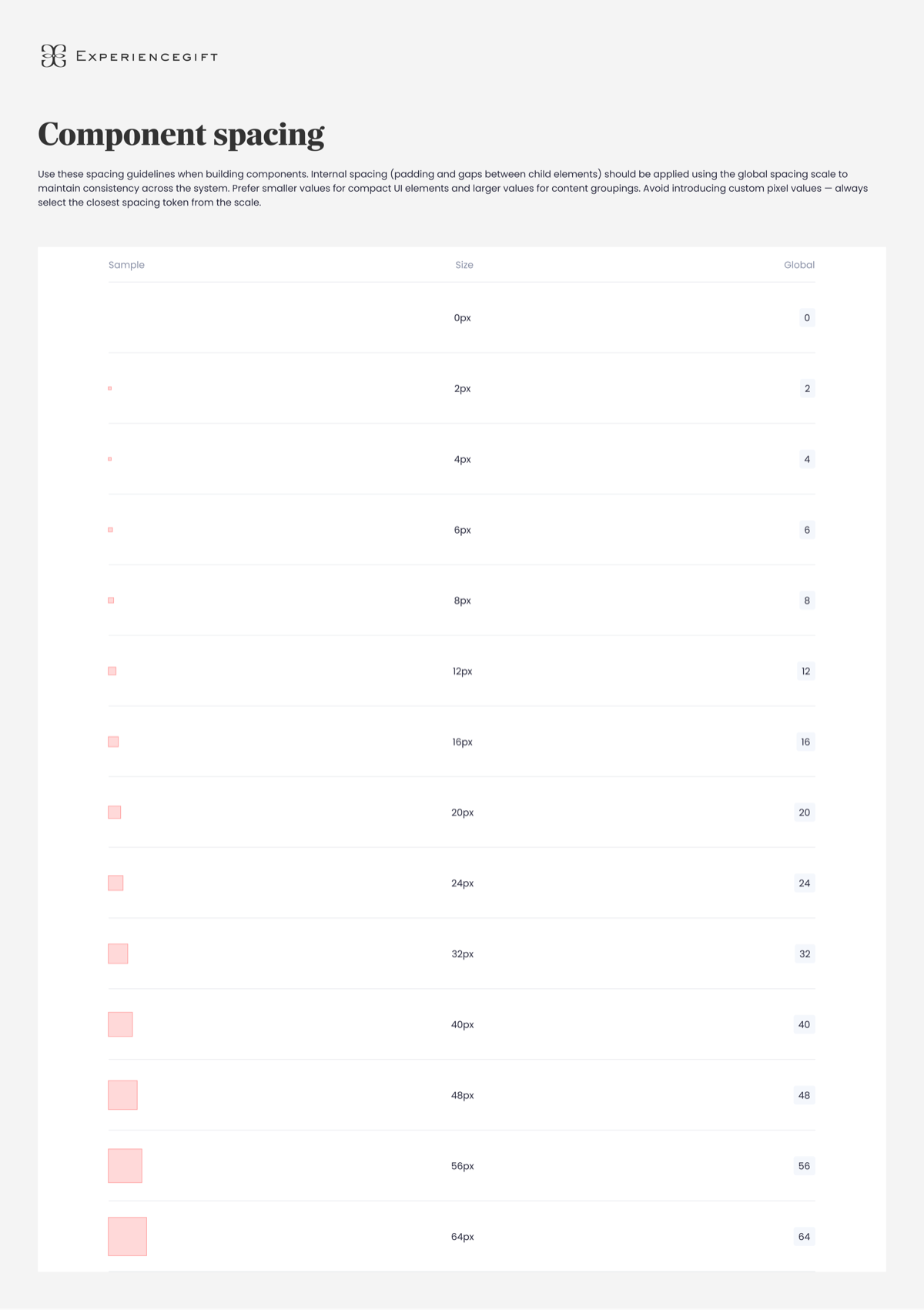
Based on these insights, I established a set of core design foundations that could support the entire ecosystem. The color system was expanded to include digital use cases and UI states, while typography and spacing were structured to provide consistent hierarchy and layout patterns.
To support the multi-brand ecosystem, the system was designed with a scalable structure that allowed shared components to adapt to different brand themes. By separating primitive values from semantic usage, the system could maintain consistency while allowing each brand to express its identity.
Accessibility was also considered throughout the process to ensure that color usage and interface patterns supported readable and usable experiences.
Design foundations
Building a scalable foundation for color, typography, and spacing across multiple brands.
Outcome
The new foundations provided a clearer framework for implementing the brand across digital products. By introducing structured foundations and token collections, the design system became easier to use for both designers and developers.
The system enabled more consistent interfaces across brands, improved collaboration between design and engineering, and created a scalable foundation that supports future product development within the Experiencegift ecosystem.
- Clearer framework for brand implementation across digital products
- Structured foundations and token collections for easier use
- More consistent interfaces across all brands
- Improved design-engineering collaboration
- Scalable foundation for future product development