Case study · Eazle (Heineken)
Heineken EU Guidelines
Implementing the EU brand guidelines across eazle
Client is Eazle (Heineken)Industry is B2B e-commerce · BeveragesTimeline is 2023 – 2024
Bringing the new Eazle brand into the B2B ordering platform for European markets — colour, type, icons and shape.
- Brand to product
- Design systems
- UI audit
- UI design
- Stakeholder alignment
Goal
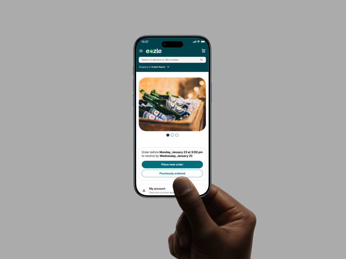
In 2023, the new Eazle brand for Heineken E-commerce was introduced. Previously, the platforms used inconsistent branding and lacked a unified visual identity.
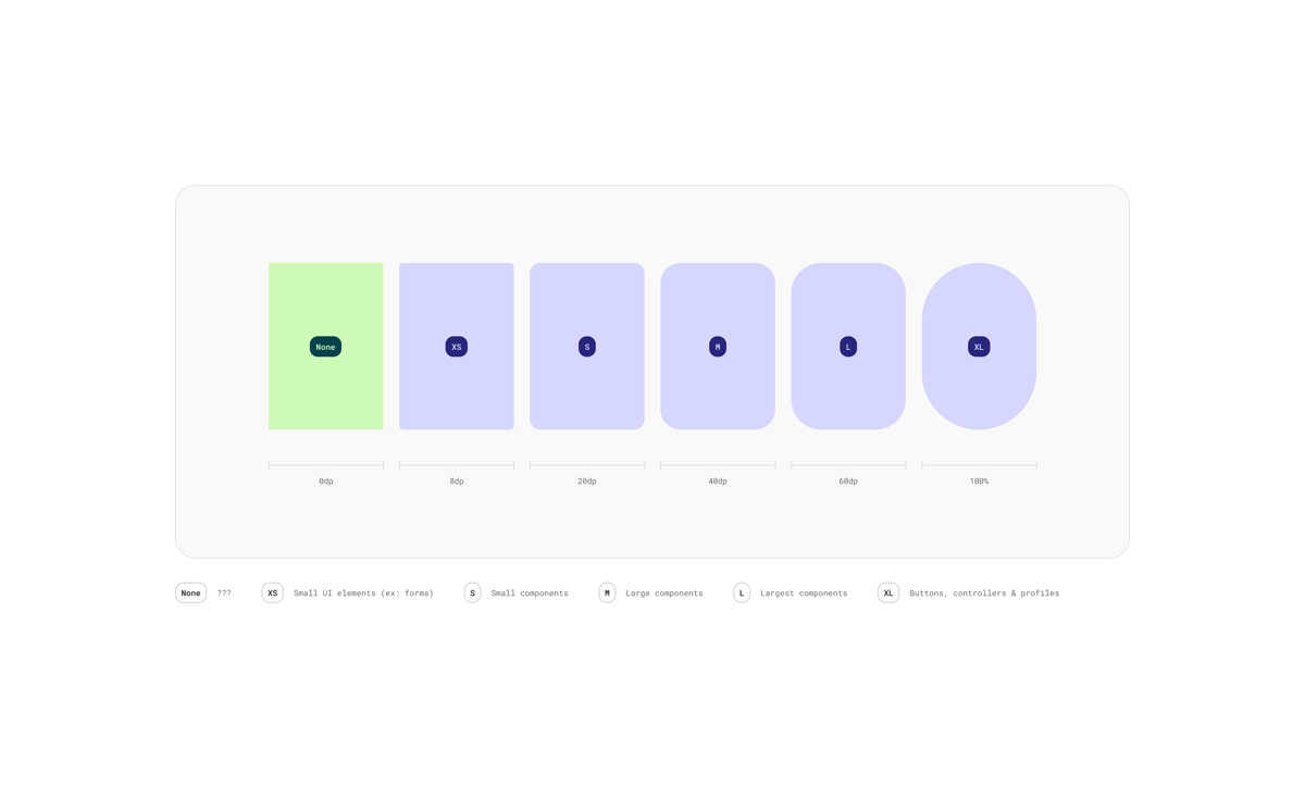
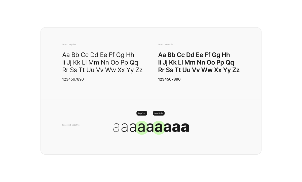
The goal was to refresh the platform's visual identity to align with the new Eazle brand, updating typography, icons, colors, and shapes. This would create a consistent visual language and ease the transition when adopting the new design system.
Design guidelines
European market guidelines for shapes and fonts to ensure brand consistency.
Design elements
Colors, typography & icons
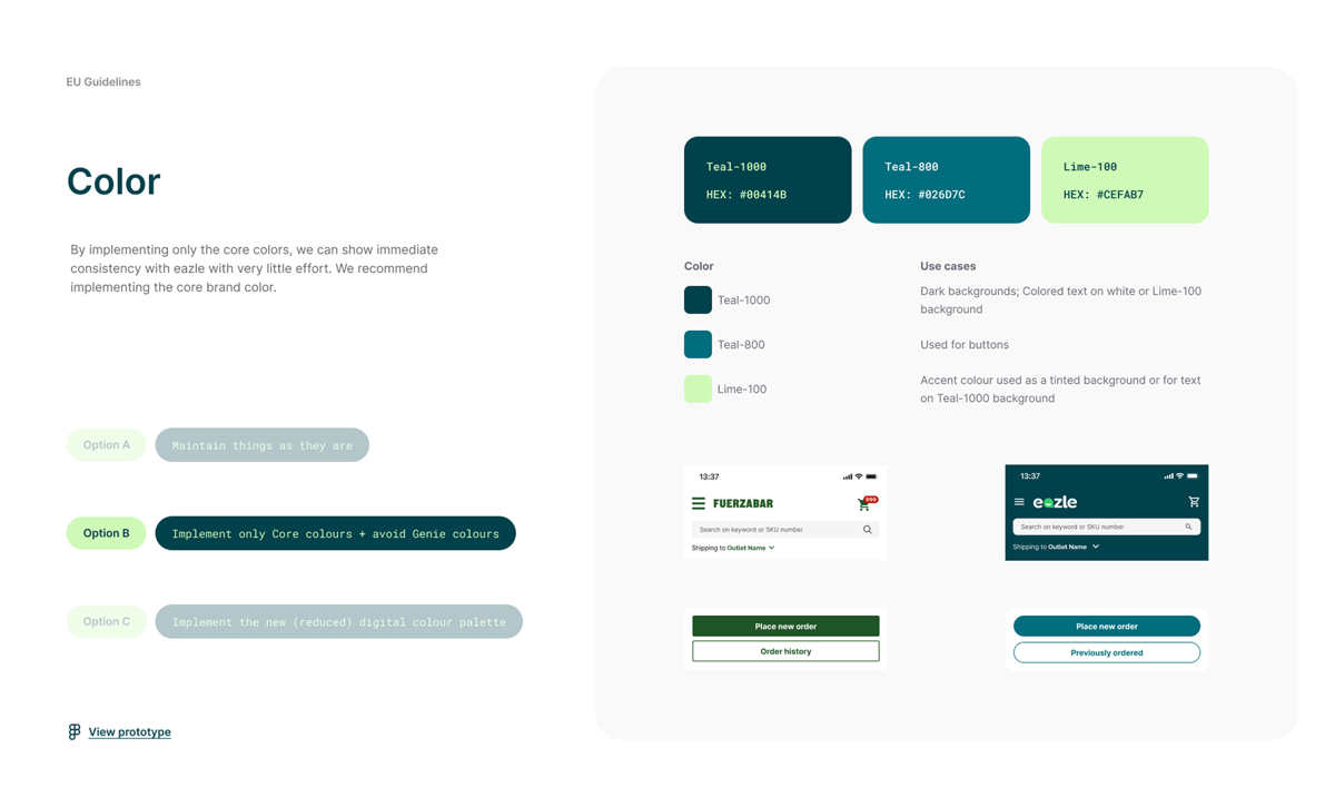
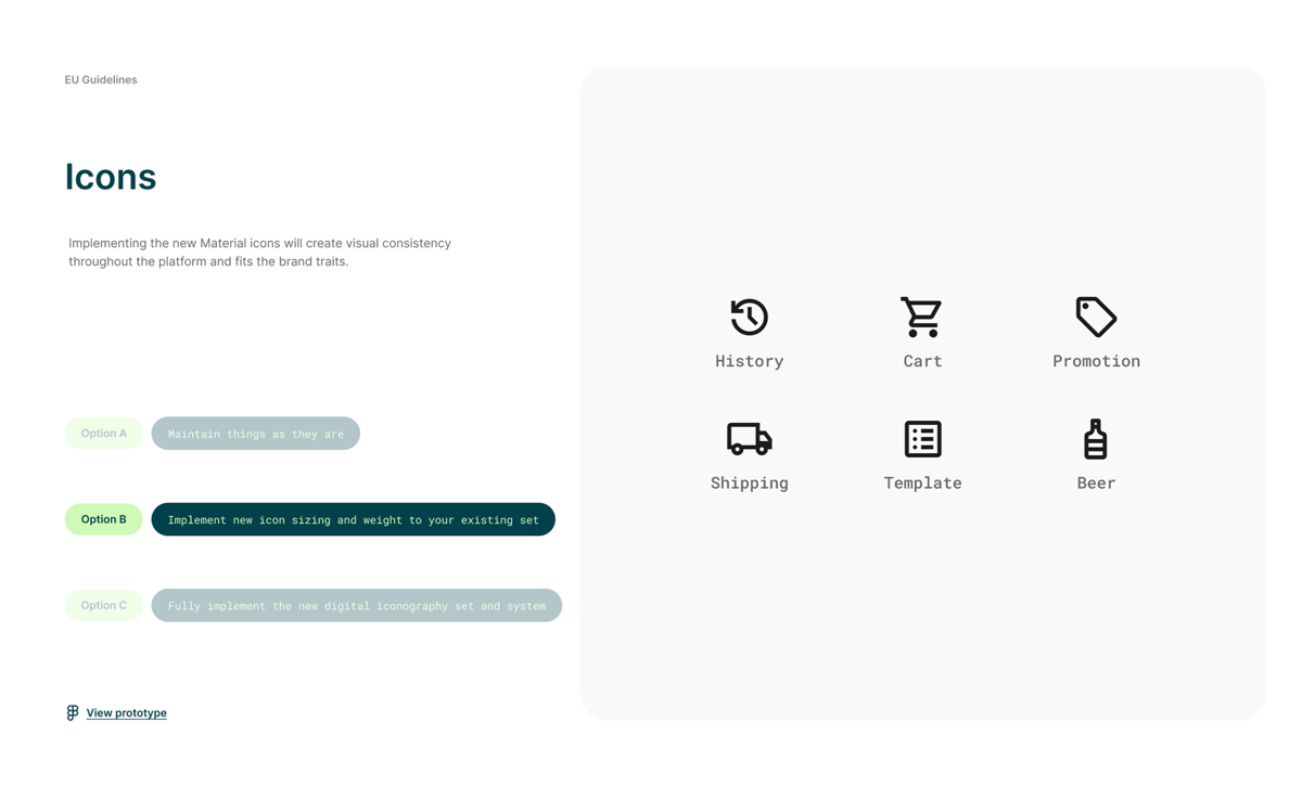
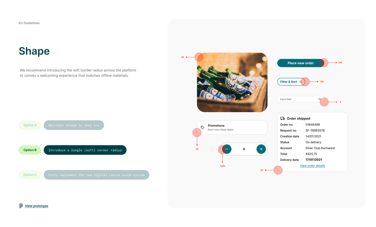
For each element we offered three levels of change — A: maintain things as they are, B: a focused update, C: full implementation — and recommended option B.
Implementation
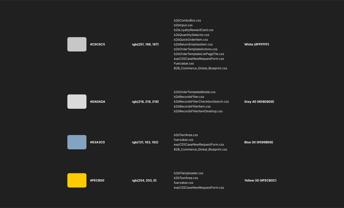
The brand alignment project involved updating components across multiple platforms. We conducted a comprehensive color audit to identify all instances where old brand colors were used and systematically replaced them with the new Eazle palette.
Typography was updated to use the new brand fonts, ensuring consistency across headers, body text, and UI elements. Icon libraries were refreshed to match the new visual language, and component designs were updated to reflect the rounded, modern aesthetic of the Eazle brand.