Case study · Away.ai
Away.ai
A whole trip, booked in one chat.
Client is Away.aiRole is UX & UI, design systemIndustry is Travel · AI travel assistantTimeline is Dec 2025 – Aug 2026It took 9 months
Taking an AI travel assistant from rough low-fidelity concepts to a launched, branded booking platform in nine months.
- Product design
- UX/UI
- AI
- Design systems
- Brand to product
- User testing

Designing a new way to plan and book travel
Booking a trip usually means a dozen tabs. Flights in one, hotels in another, three more to compare prices. Away.ai wanted all of it in one chat.
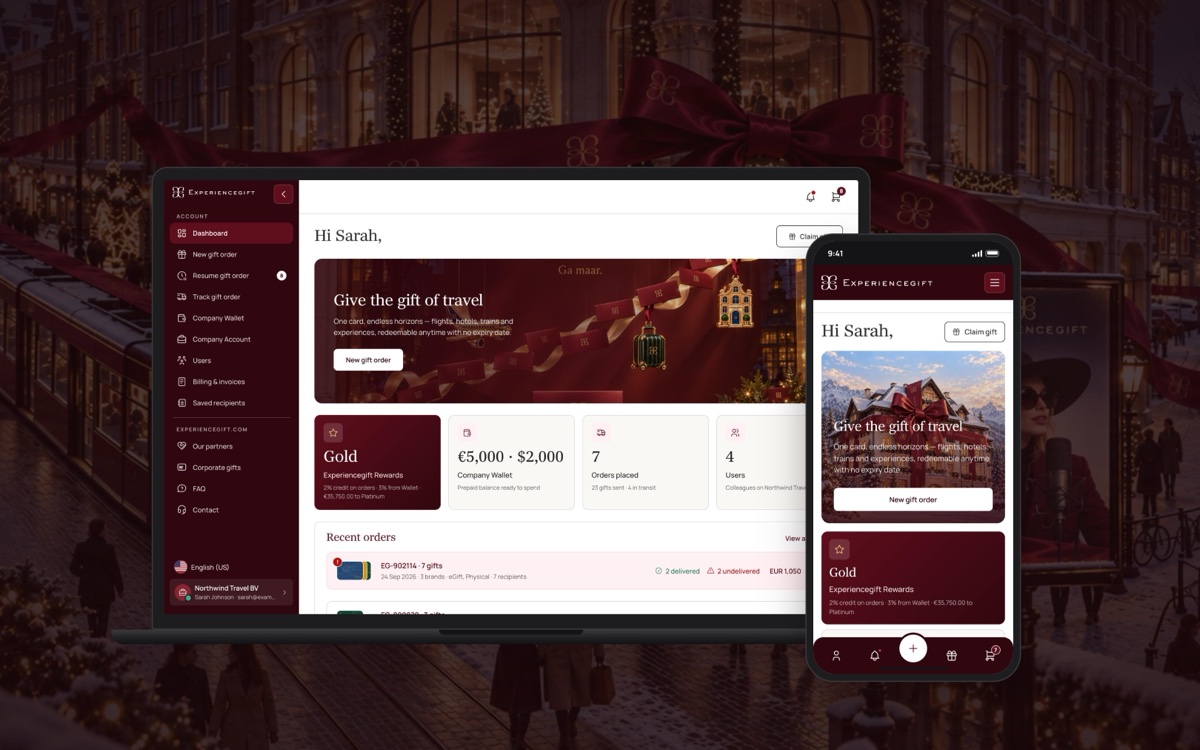
I joined when the product was a set of rough wireframes. Nine months later it was live, with a new brand, a design system and every main flow in place.








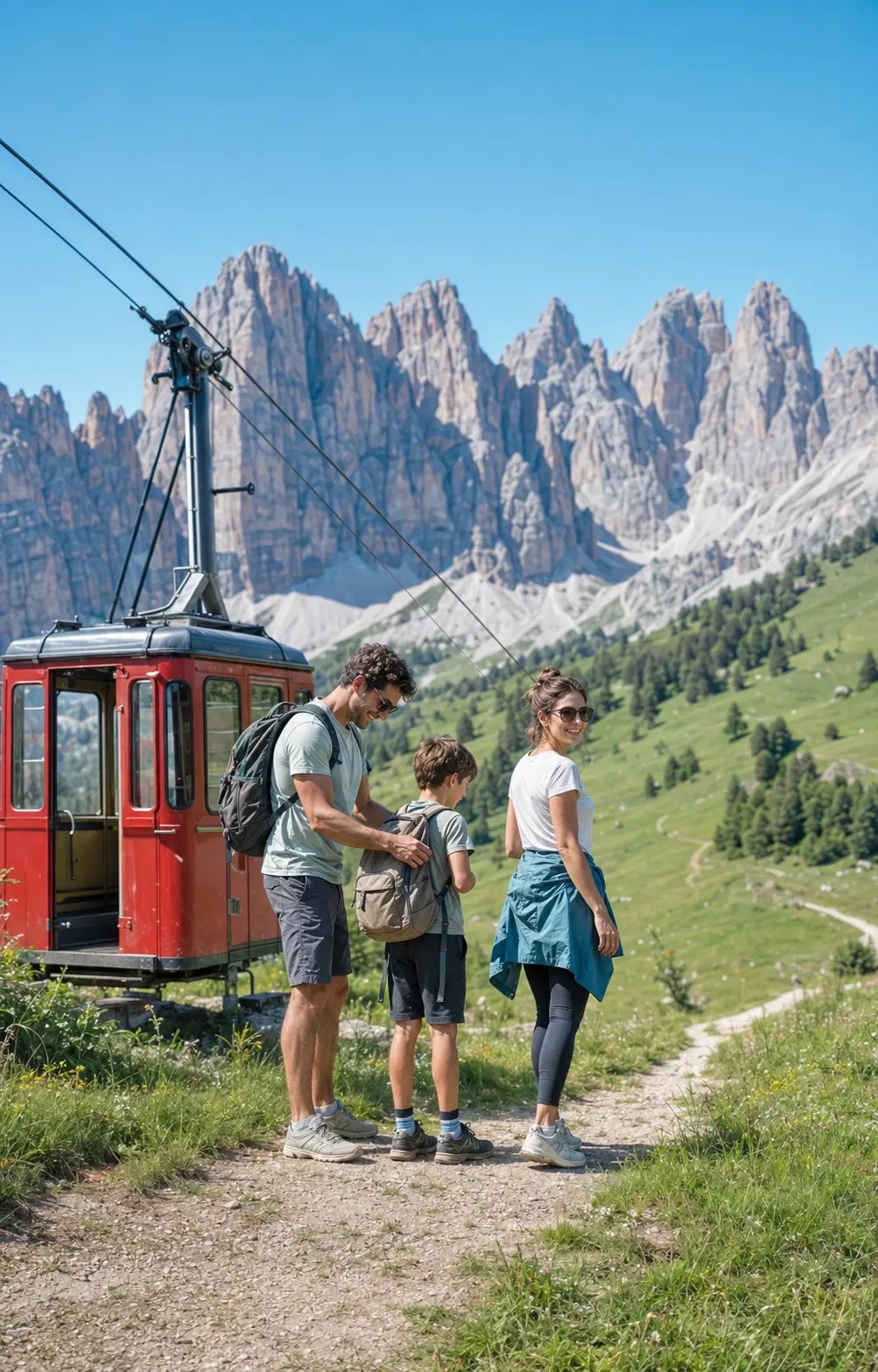

My role
I worked closely with product, engineering and stakeholders throughout the project. My role covered both UX and UI, from turning low-fidelity ideas into high-fidelity screens and flows to building out the design system and bringing the new brand identity into the product.
A major part of the work was translating the new branding, created by an external branding agency, into a functional product interface.
I defined the new colour palette, typography, spacing and visual foundations, and created and adapted components to establish a new design system that could work across the product.
I worked across a wide range of experiences, including:
- 01
Homepage and AI chat
- 02
Destination search and results
- 03
Hotel and flight booking
- 04
Account creation and account management
- 05
Checkout and payment screens
- 06
Wallet
- 07
Referral experience
- 08
Cashback experiences
- 09
Navigation
- 10
Email templates
- 11
Booking flows and supporting states


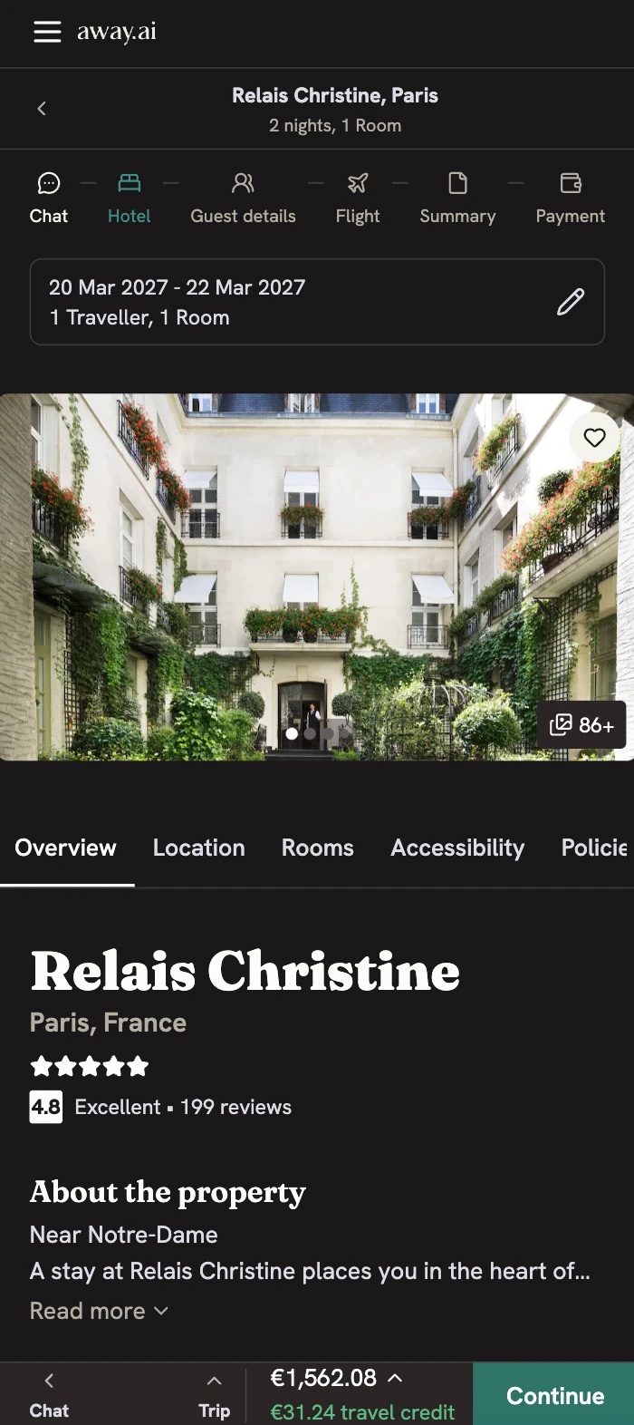
Hotel page
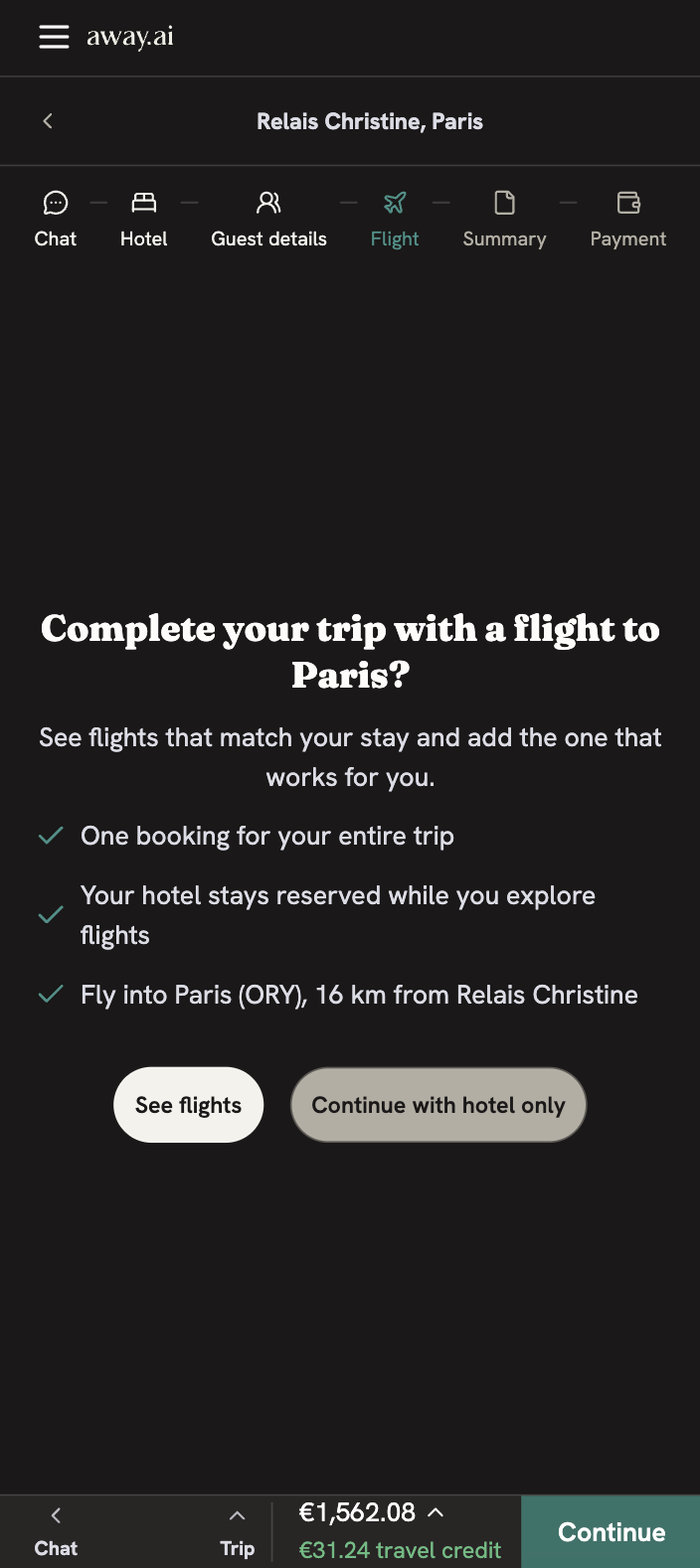
Add a flight
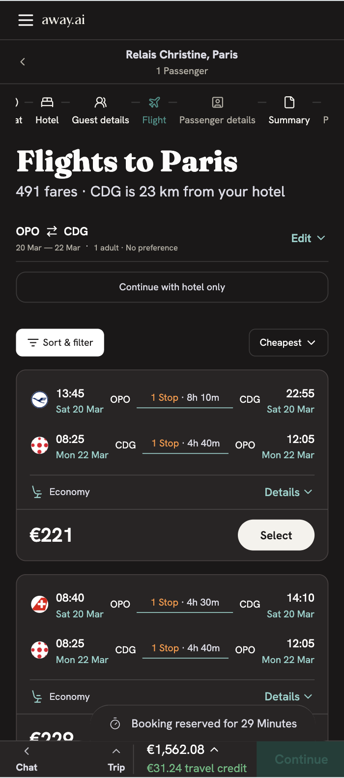
Flight results
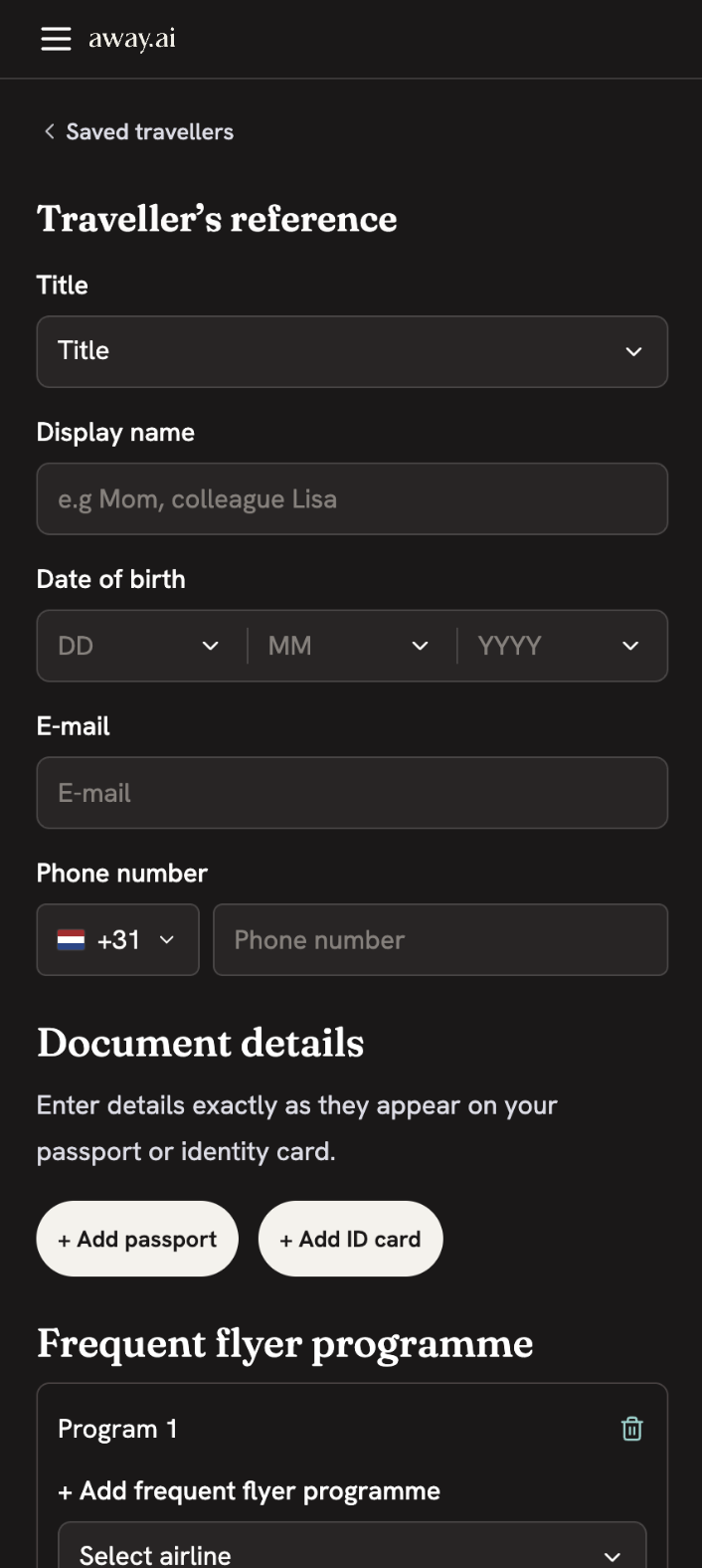
Saved traveller
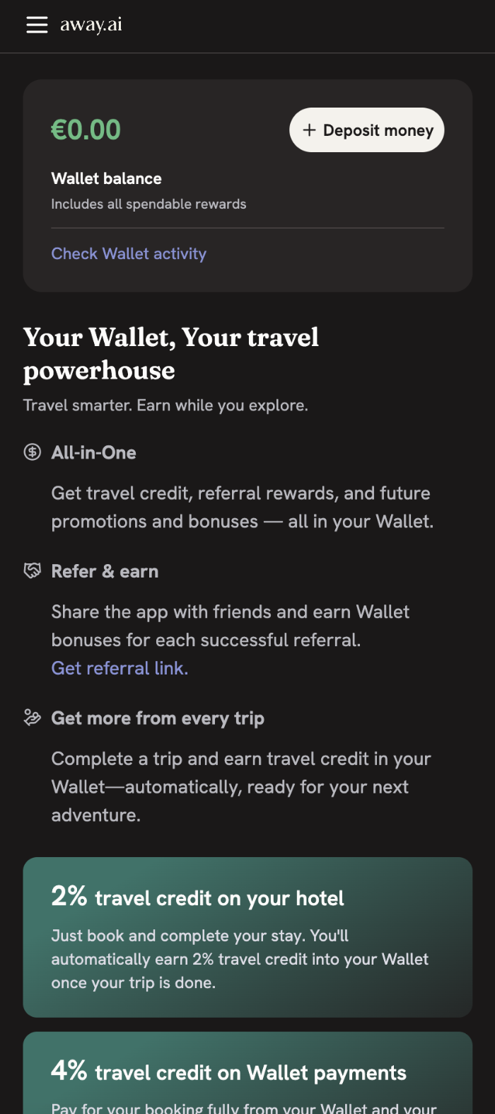
Wallet
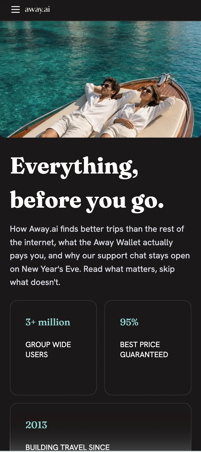
About page
The product evolved significantly throughout the nine months. We worked in short iterations, moving from rough concepts to increasingly detailed flows and interfaces as requirements became clearer and the product took shape.
Designing through iteration
The homepage and AI chat were some of the areas that went through the most exploration.
Our first approach was to put filters directly next to the chat input, allowing users to activate them while describing what they were looking for. Search results would then appear underneath the conversation.
After getting the first version in front of users, we noticed a clear pattern. Users largely ignored the filters and went straight into the conversation. At the same time, results loading underneath the chat were easy to miss. The experience was asking users to understand too much before they could see the value of the product.
So we changed direction.
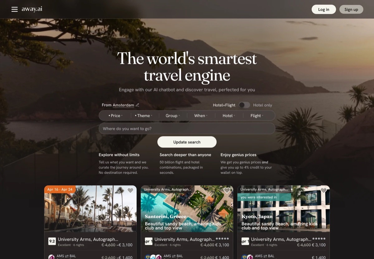
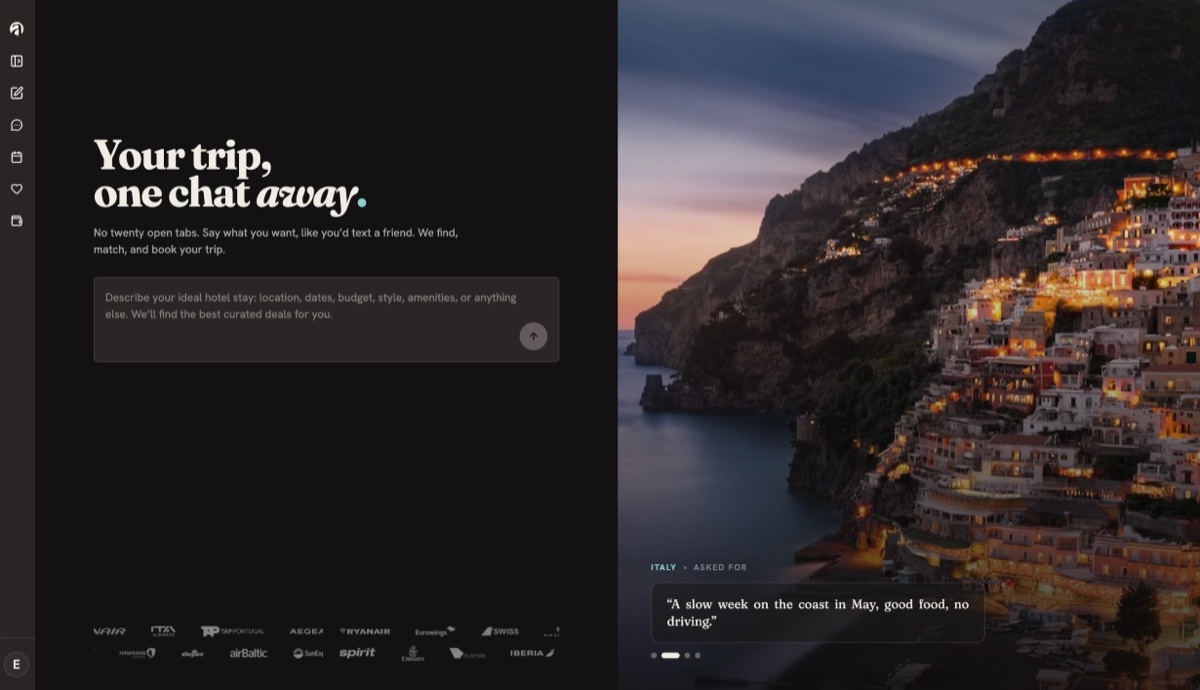
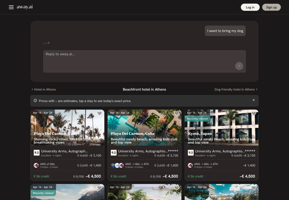
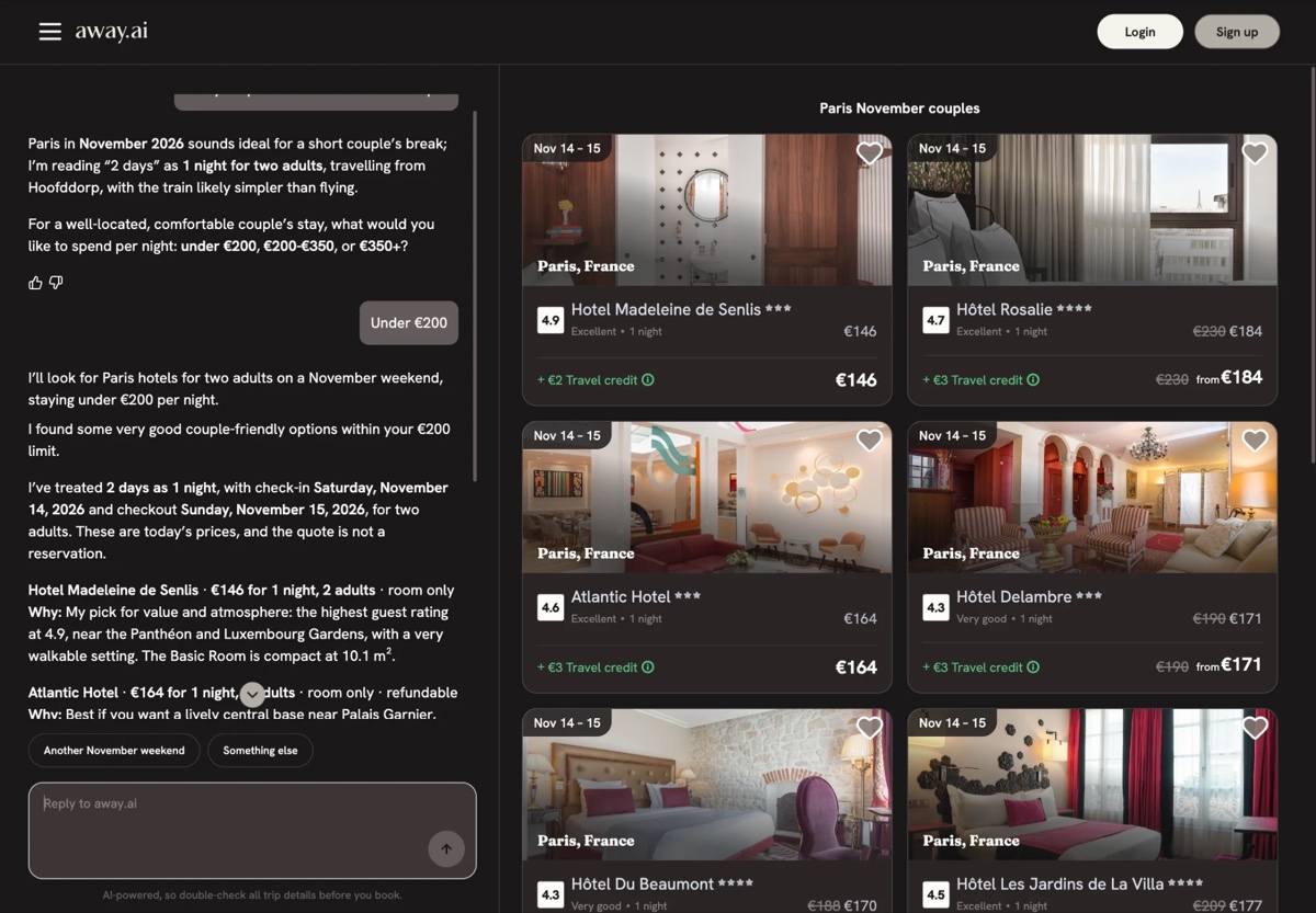
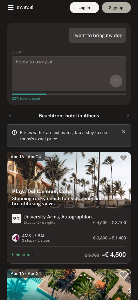
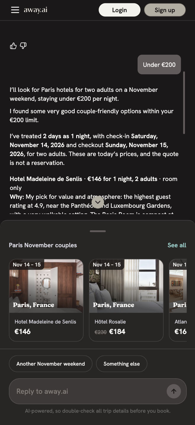
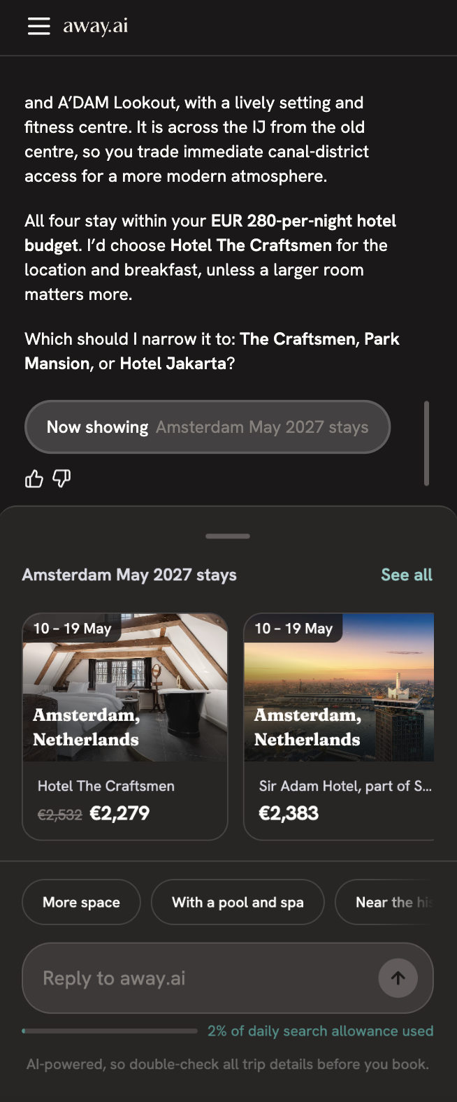
Instead of presenting results underneath the conversation, we simplified the homepage around the chat itself. We introduced inspirational destinations and example prompts to help users get started, alongside the product's key benefits.
Once a conversation starts, the experience transitions into a split view, with the conversation on one side and the relevant travel results on the other.
This meant users could have a natural conversation while seeing the results immediately, without having to search for them or understand additional controls first.
The goal wasn't to add more functionality to the interface, but to remove the friction around it.
The goal wasn't to add more functionality to the interface, but to remove the friction around it.

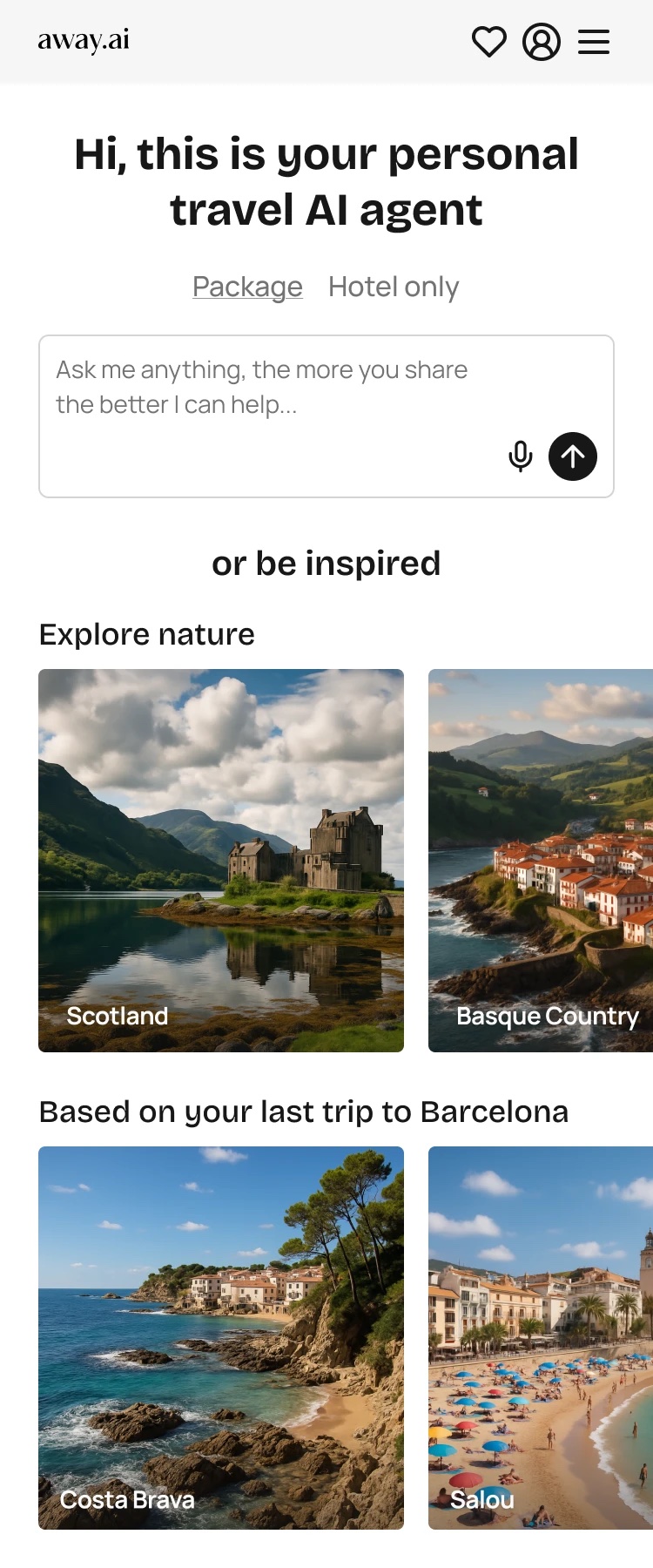
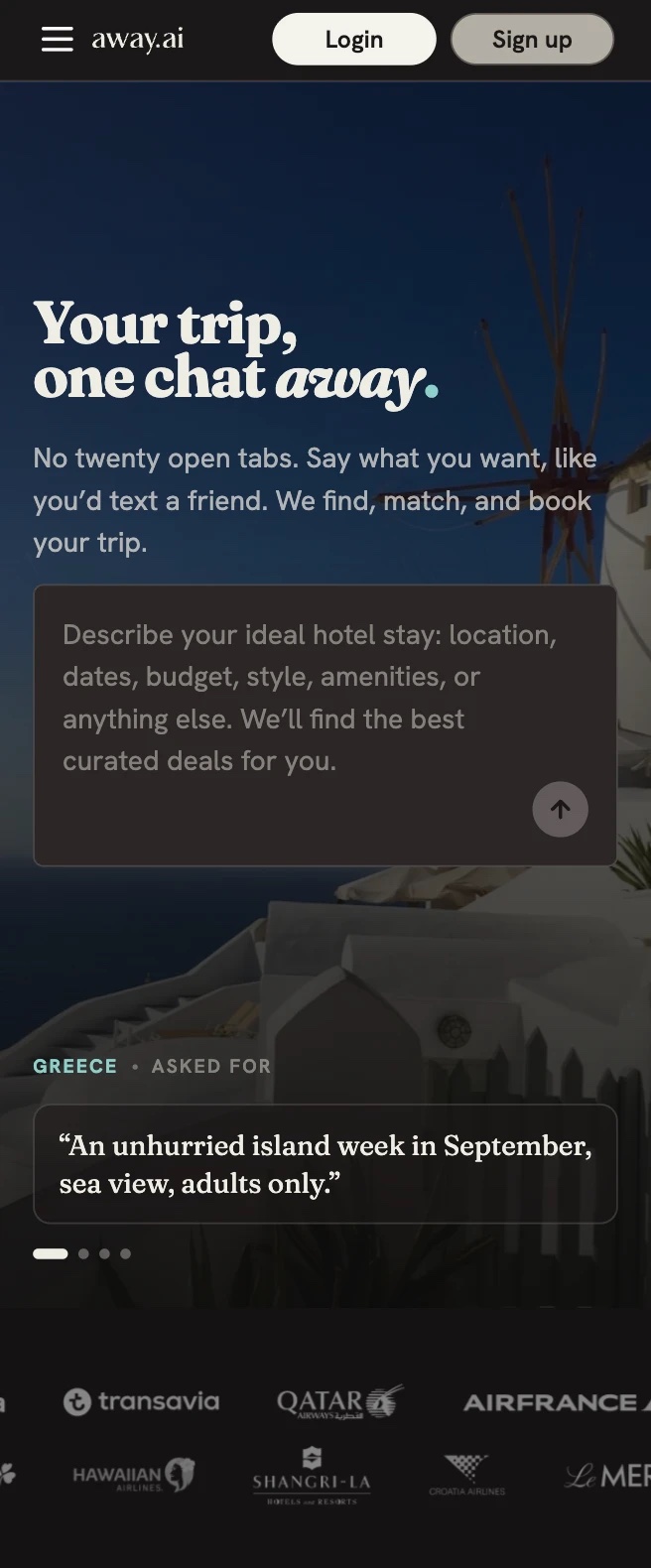
Homepage
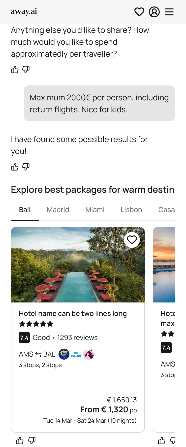
Chat results
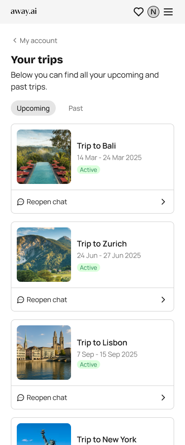
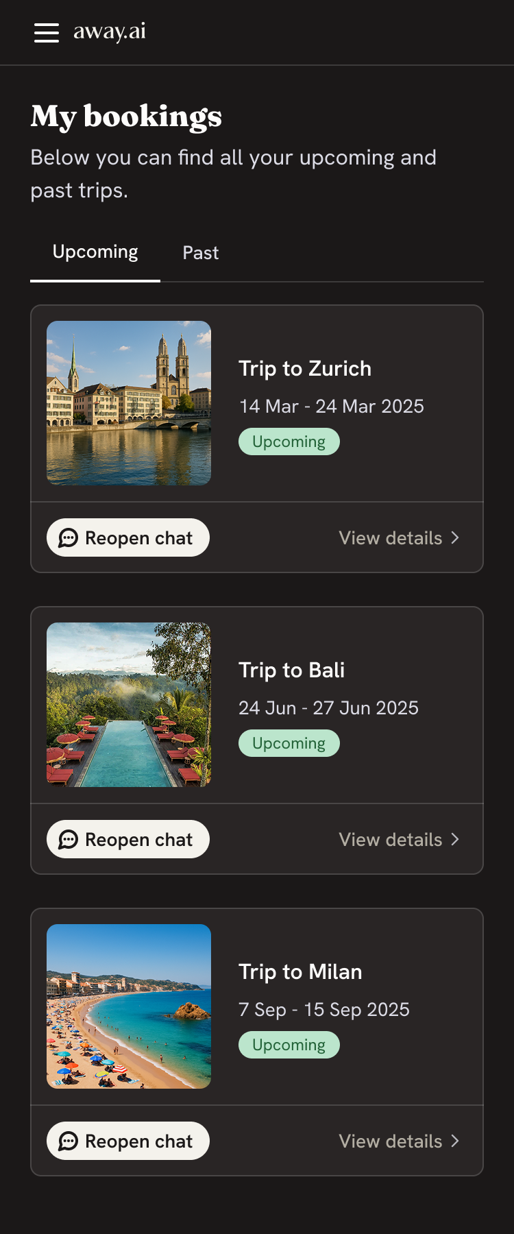
My trips
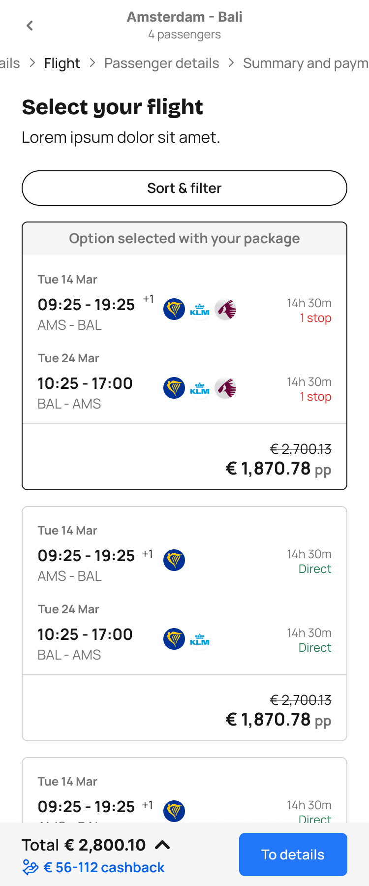
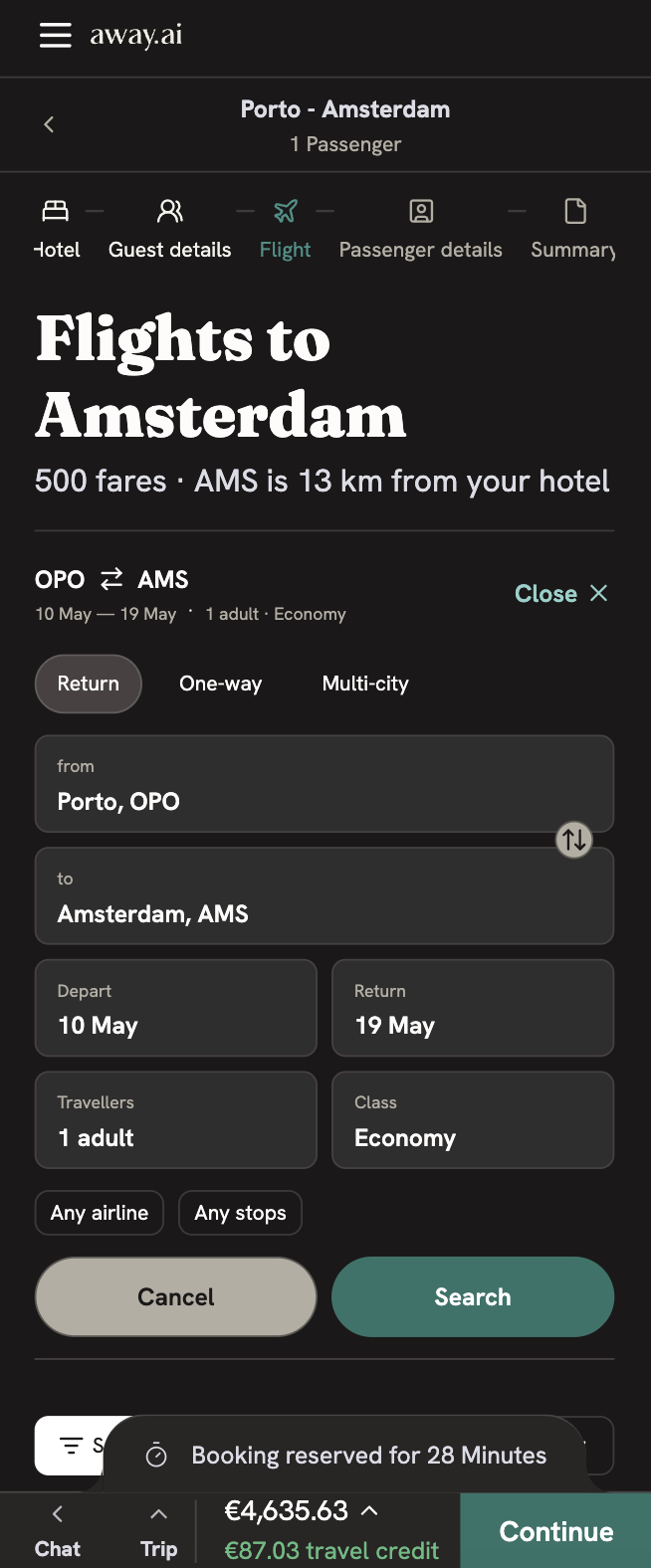
Flight selection

Building the design system
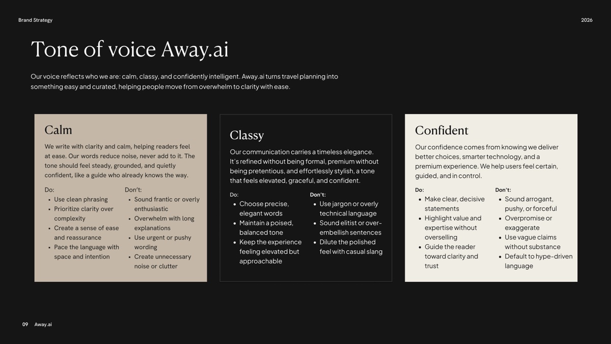
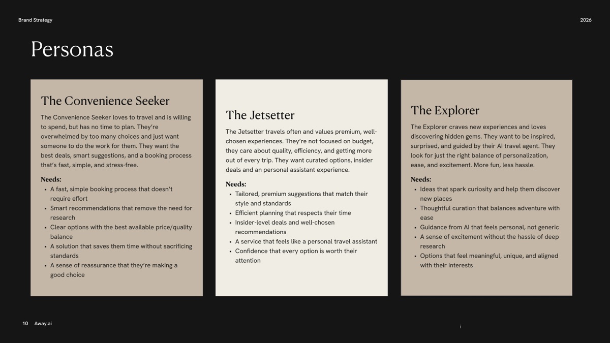
The new brand also meant rethinking how the visual language worked inside a real product.
I translated the brand guidelines into a scalable design system, defining the foundations and creating components that could be reused across different parts of the experience.
This included defining the colour palette, typography, spacing, component styles and interaction patterns needed to bring the new identity consistently into the product.
The system became particularly important as the product grew. New features, booking states and iterations were being designed and developed throughout the project, so having a consistent foundation allowed us to move quickly without losing coherence.
The design system evolved alongside the product rather than being treated as a one-off deliverable.

Working at speed
We spent a lot of time looking at both established travel platforms and newer AI products to understand how people were already searching, comparing and booking.
Competitor analysis was an important part of the process, but the goal wasn't to simply reproduce existing patterns. We looked at what worked well in familiar travel experiences and where an AI-driven product could approach things differently.
I worked closely with engineering and stakeholders throughout the project, keeping the design process closely connected to what was being built. This allowed us to move quickly, discuss trade-offs early and refine ideas as the product evolved.
As we got closer to launch, we also put the product in front of external users and used their feedback to identify areas that needed more clarity or refinement. The wider team contributed as well, using the product and reporting bugs, confusing interactions and optimisation opportunities.
From concept to launch
From the moment I joined the project, it took nine months to turn the early concepts into a fully functioning platform.
During that time, the product went through many iterations — from smaller changes to navigation and destination cards to much larger shifts in the homepage, AI chat, booking journeys, checkout, wallet, referral and account experiences.
At the same time, the visual identity was brought into the product and developed into a working design system that could support the entire experience.
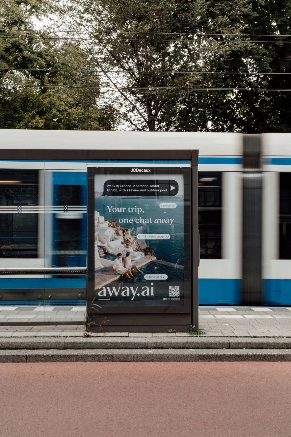
The launch took place in Amsterdam, with the product available worldwide and a large campaign and advertising push supporting the release.


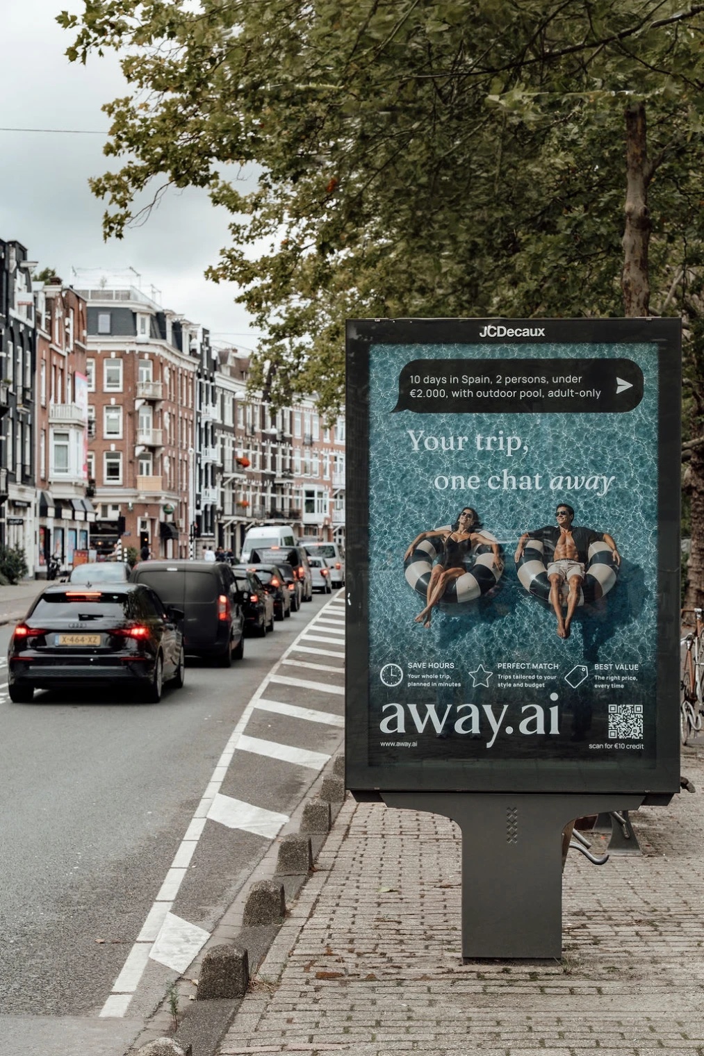
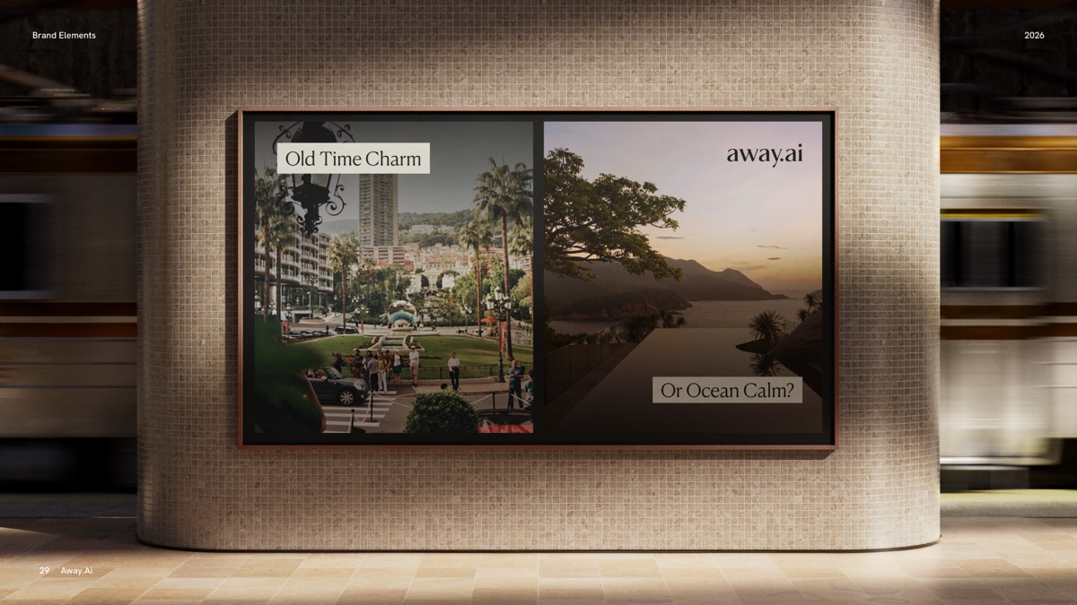
What I found most interesting about the project was seeing how much the product changed between the first rough concepts and the final platform. The work wasn't simply about taking an existing design and polishing it. The product, brand and experience were all taking shape at the same time.
Over nine months, I helped take Away.ai from early low-fidelity ideas to a fully functioning, branded travel platform — shaping the experience, building the visual system and working closely with the people bringing it to life.