Case study · Eazle (Heineken)
Heineken Reordering
Making reordering effortless on eazle
Client is Eazle (Heineken)Industry is B2B e-commerce · BeveragesTimeline is 2025
Discovery, data and experiments to make reordering the default way bars and shops buy on eazle.
- Research
- Data analysis
- UX/UI
- Prototyping
- A/B testing
- Personas
The challenge
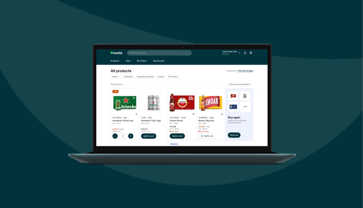
We set out to improve the reordering experience on eazle after discovering it was difficult for users to find previously purchased items, leading to frustration and drop-offs.
Through data analysis and user research, we found that reordering makes up the majority of baskets, yet it was treated as a secondary flow. This insight guided us to explore design directions that prioritise reordering, including changes to sorting logic and copy, which we validated through testing.
Assessing previous optimisation
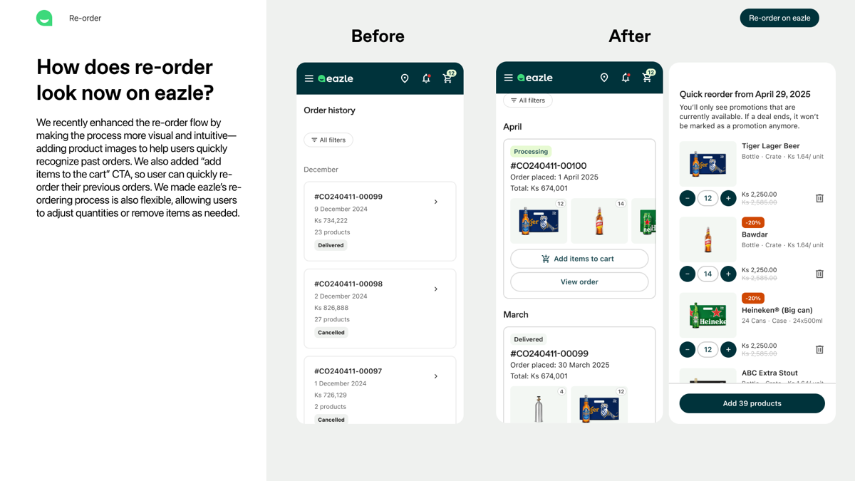
We recently enhanced the re-order flow by making the process more visual and intuitive — adding product images to help users quickly recognize past orders. We also added an “add items to cart” CTA, so users can quickly re-order their previous orders, and made the process flexible, allowing users to adjust quantities or remove items as needed.
Still, re-ordering from the My Orders page wasn’t yet the main way people bought. Only a small share of users interacted with the re-order CTA — for example 1.47% in Myanmar and 0.52% in Nigeria — and My Orders got a moderate number of visits compared with the product listing, cart or checkout (on average the 4th most visited page). Most markets would need better visibility and easier access to make re-ordering a default habit.
Reordering ≠ Ordering
Key insight
This project started with a broad discovery phase to understand why reordering on eazle felt harder than it should. We dug into data from GA4, Hotjar, path analysis, focus groups, and market research to map the pain points. The problem became clear: users struggled to find previously purchased products, which made reordering inconvenient and increased the risk of drop-offs.
Problem statement
Reordering on eazle is difficult due to poor visibility of previously purchased products, leading to lower convenience, engagement, and higher drop-off risk. It connects directly to the order-placement OKR: position eazle as customers’ preferred ordering channel by simplifying the purchase journey.
Goal
Optimise the re-order experience and streamline the ordering process to reduce friction, improve efficiency, and time spent on ordering.
The data
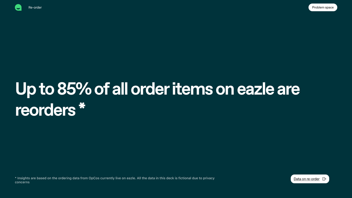
Up to 85% of items in a basket are repeat purchases, yet the app treated reordering as a secondary flow. This mismatch signaled a big opportunity.
Insights from other platforms pointed the same way: on Salesforce, the “Previously Purchased” page was the second most visited page after the homepage, and Hotjar recordings showed users going to My Orders to look up past products, then back to the product listing to find and reorder those exact items.
Key personas
Understanding users
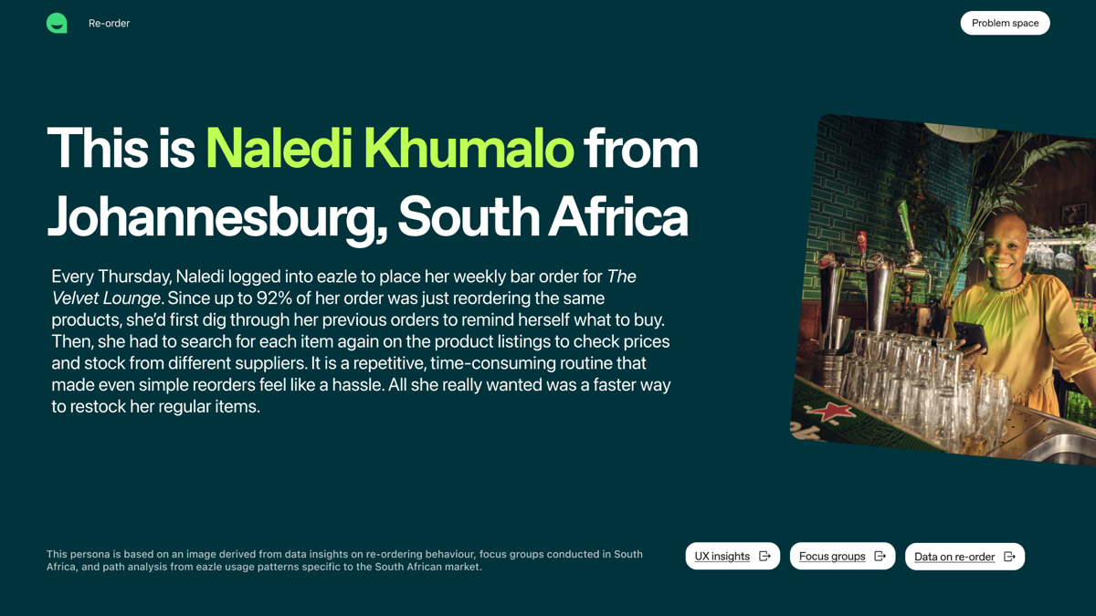
Naledi runs The Velvet Lounge in Johannesburg. Every Thursday she places her weekly bar order — almost all of it the same products as last time — by first digging through previous orders, then searching for each item again to compare prices and stock across suppliers.
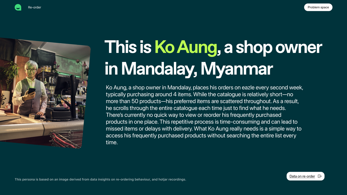
Ko Aung owns a shop in Mandalay and orders about four items every second week. His catalogue is short, but his usual products are scattered through it, so he scrolls the whole list every time.
One navigating a large catalogue, the other a small one — but both showed the same thing:
- 01
Re-ordering matters most, because the majority of items customers order are re-orders.
- 02
Customers can’t easily re-order the individual products they buy oftenfinding them one by one takes time.
- 03
The platform lacks clear visibility of, and intuitive access to, previously purchased items.
Success metrics
How we measure impact
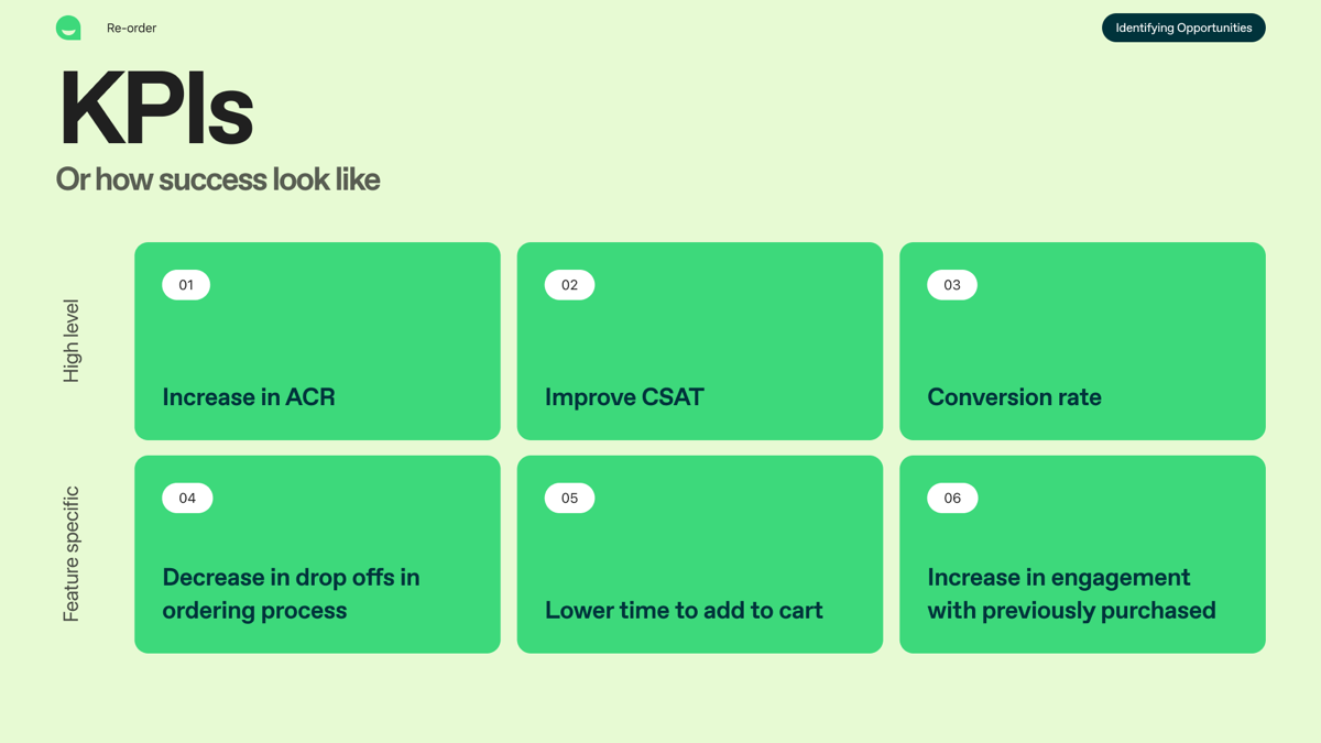
We defined high-level KPIs — an increase in ACR, better CSAT and conversion rate — and feature-specific ones: fewer drop-offs in the ordering process, less time to add to cart, and more engagement with previously purchased products. Then we mapped the journey — home, product listing, product page, cart, checkout, confirmation and My Orders — to decide where previously purchased products should surface.
Process & iterations
Design evolution
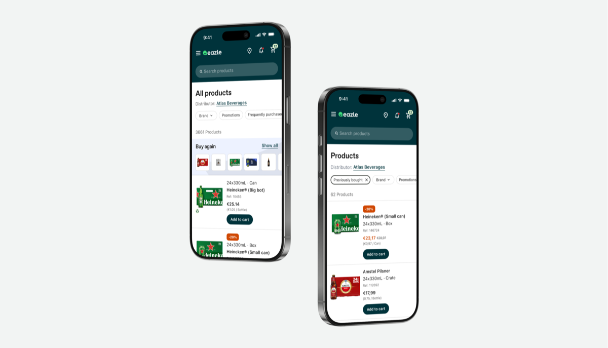
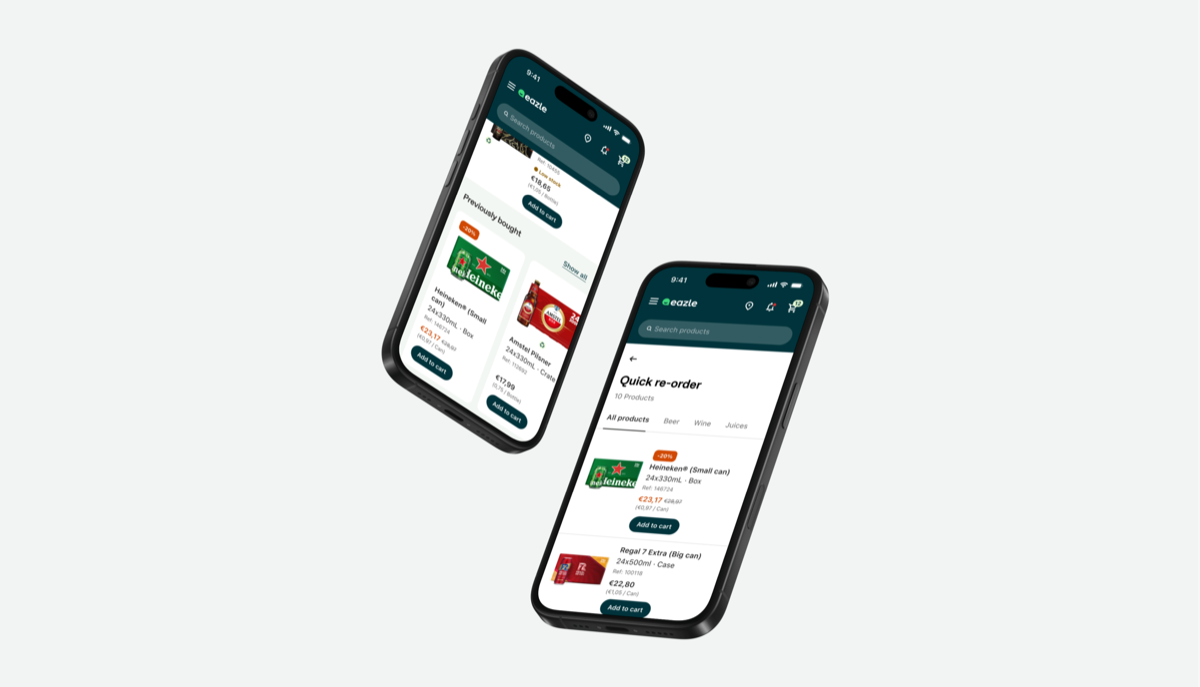
Early concepts included a banner of previously bought products on the product listing page and a ‘previously bought’ entry in the main navigation. We prioritised surfacing them on the product listing: it’s the familiar starting point, and across markets customers already compare price and stock from different suppliers there. A slider of previously bought products lets users add familiar items without browsing the full catalogue, and ‘Show all’ switches on a previously-bought filter.
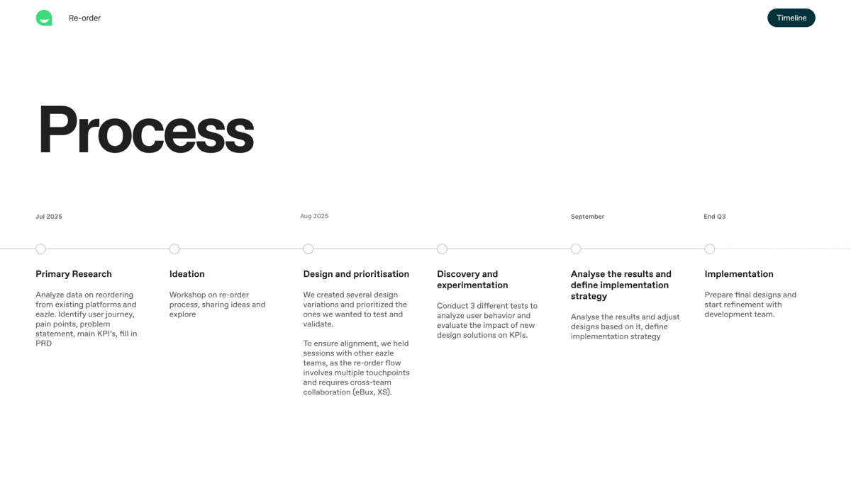
We prototyped the slider and set up an A/B test, with click-through rate as the primary success metric and time to add to cart as the secondary one.
A quick copy experiment tested four French labels for the feature. “Déjà achetés” (Previously bought) was understood best, while “Mes produits habituels” (My usual products) was preferred for its familiar, personal tone.
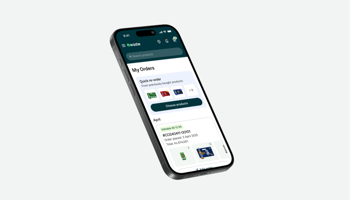
For the My Orders page, we designed a Quick re-order card and a separate ‘My Products’ tab — inspired by France, where about 20% of users open the automatically generated ‘My usual products’ list from the home page — to compare in a qualitative test.
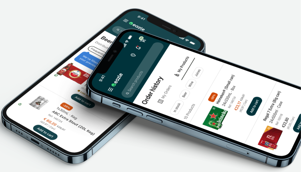
The solution
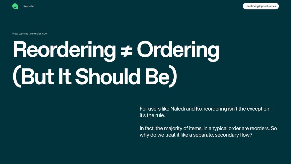
For customers like Naledi and Ko, reordering isn’t the exception — it’s the rule. So instead of treating it as a separate flow, we proposed making it the default: surface previously purchased products first in each category, and change the default sorting from ‘featured’ to ‘previously bought’.
We expected this to increase conversion, reduce friction in the ordering process and cut the time users spend placing an order.
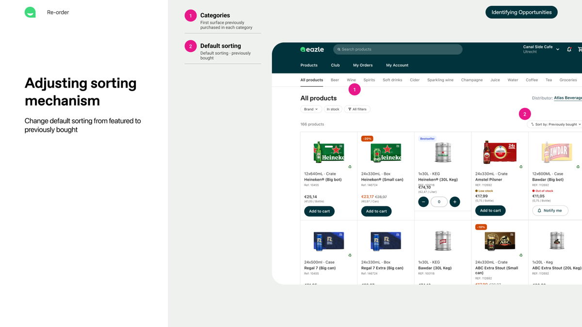
What we planned to measure
I left the project before launch. The plan at hand-over:
- 01
Review the slider A/B test to see whether users engage with previously bought items or the ‘Show all’ call-to-action.
- 02
Run the sorting experiment (potentially in France) and measure its impact on conversion rate and time to add to cart.
- 03
If sorting performs well, explore how reordering can become the primary ordering flowwhile still integrating new arrivals, best sellers and promotions.
- 04
In parallel, run the qualitative test on My Orders to learn whether showing previously purchased items there adds value.
To protect privacy, all data in this and other cases is fictional.
Next project Travelgift