Case study · Experiencegift
Travelgift
Introducing a new brand to the Experiencegift family
Client is ExperiencegiftIndustry is Gifting · TravelTimeline is Autumn 2026
Launching a new gift brand that combines flights and hotels — from the colour palette to the buy and redeem flows.
- Brand to product
- UX/UI
- Colour
- E-commerce
- Launch

Travelgift — Introducing a New Brand
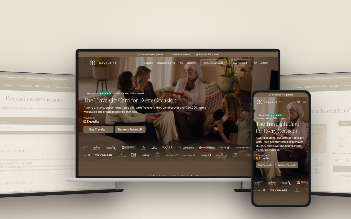
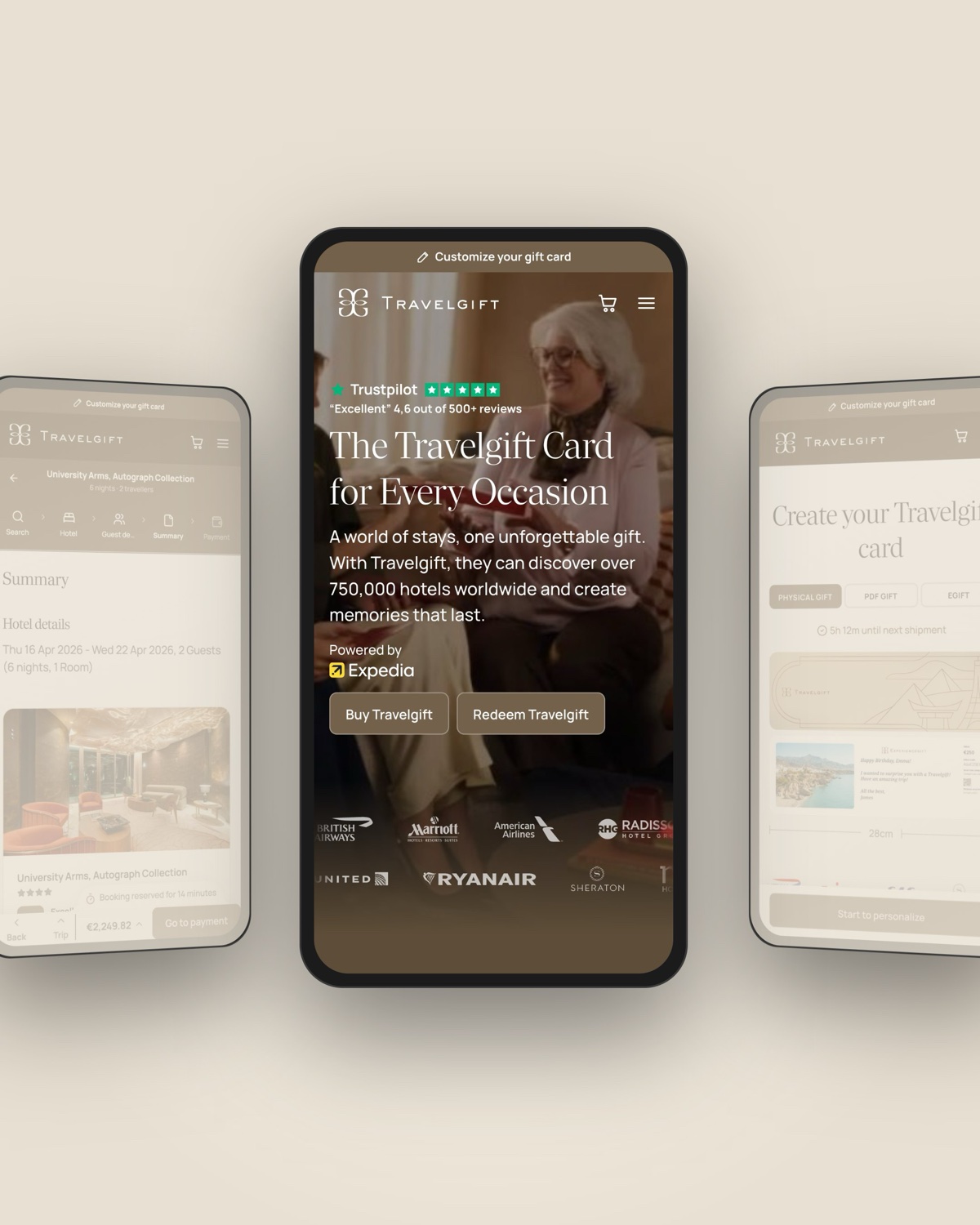
Travelgift is a new addition to the Experiencegift family, bringing flights and hotels together in one gift. Recipients can redeem their gift for a hotel stay or combine a hotel and flight into one trip, making it easier to turn a gift into a travel experience.
Creating a new experience within an established brand
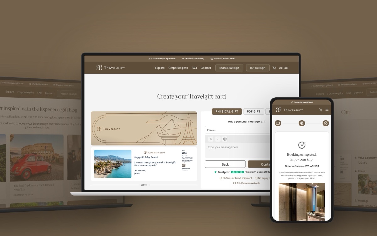
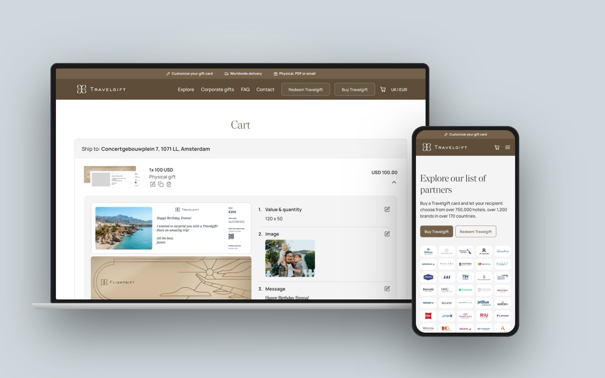
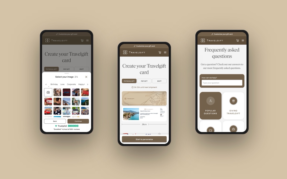
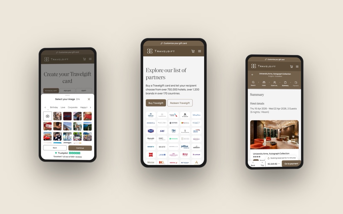
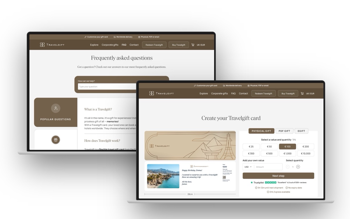
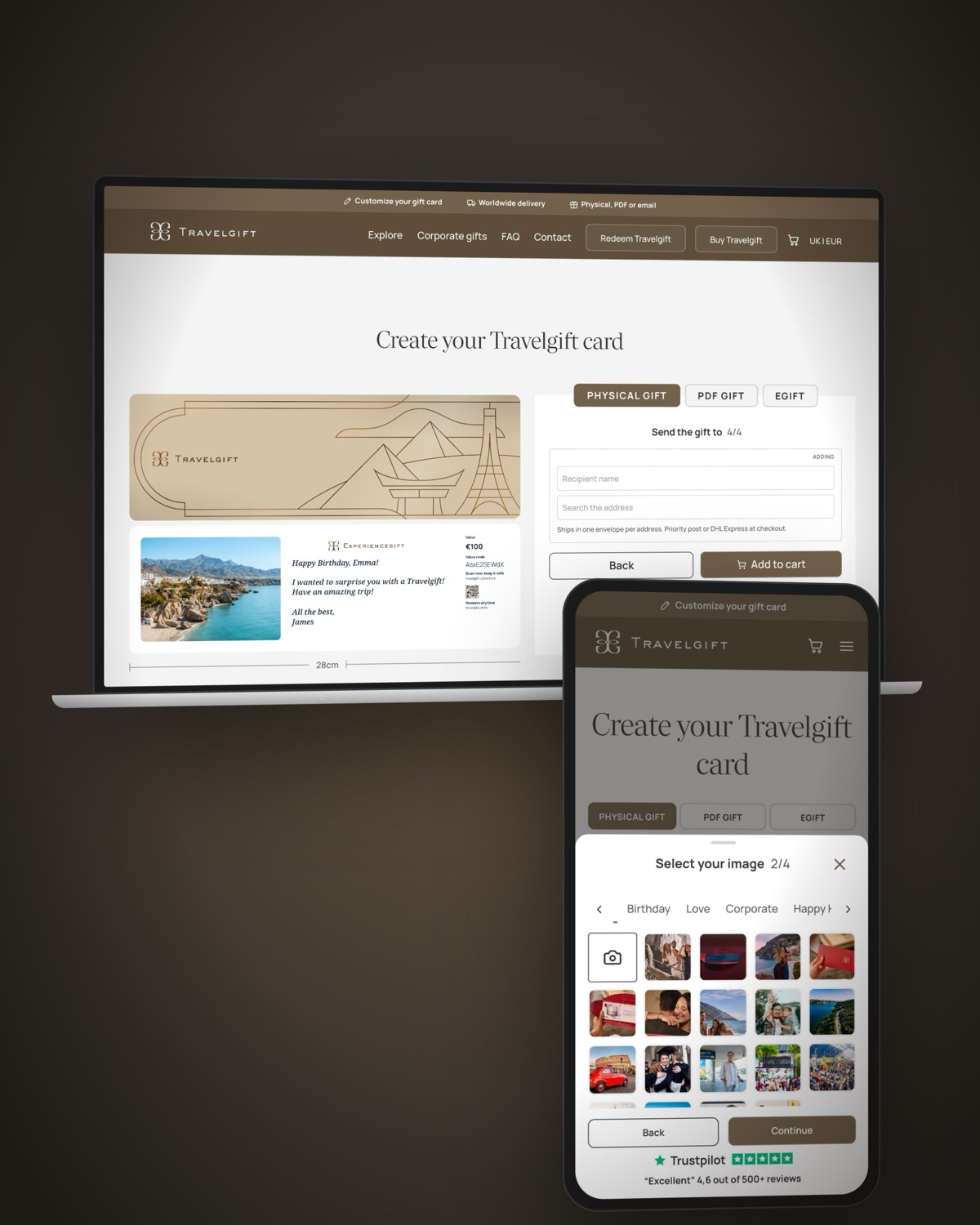
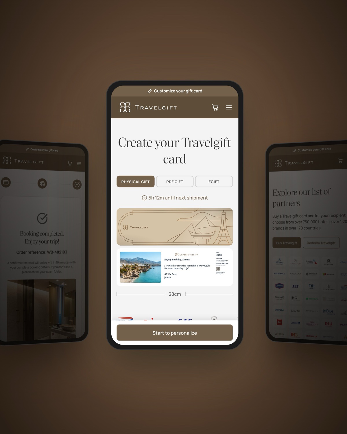
The goal was to introduce Travelgift as a distinct product while maintaining consistency with the wider Experiencegift family. We designed two key journeys: the buy flow, where customers personalise their gift card with a message or photo, and the redeem flow, where recipients choose and book their travel experience.
The buy flow

The redeem flow
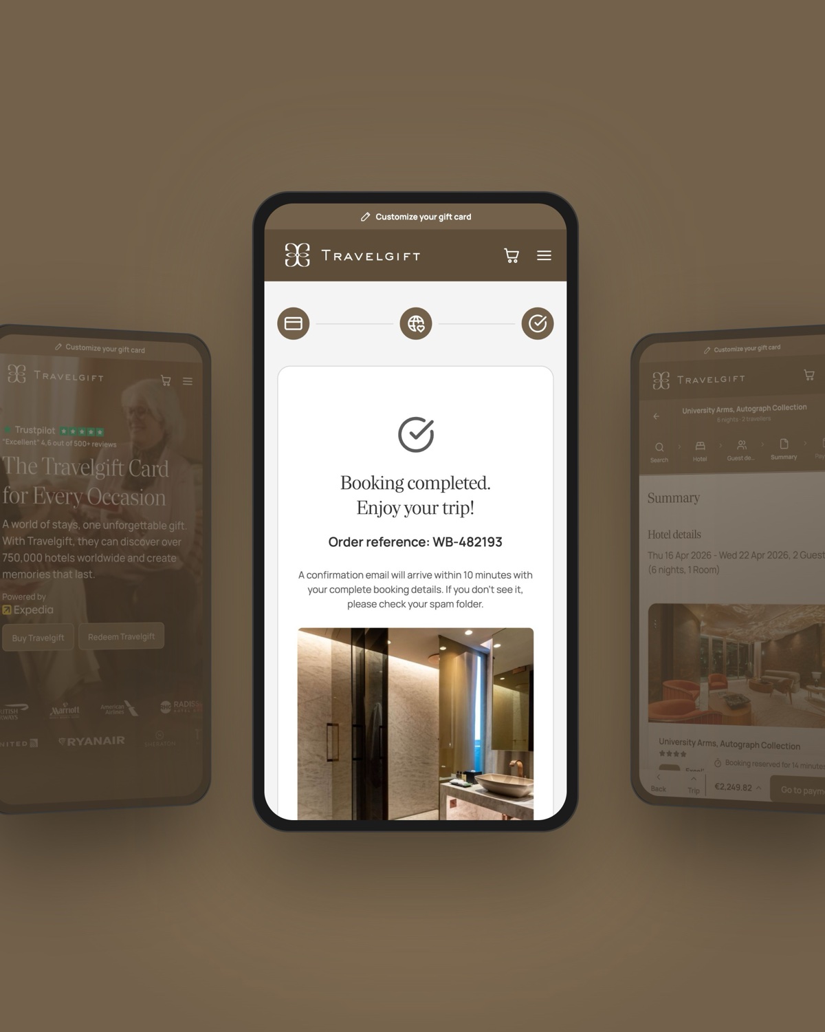
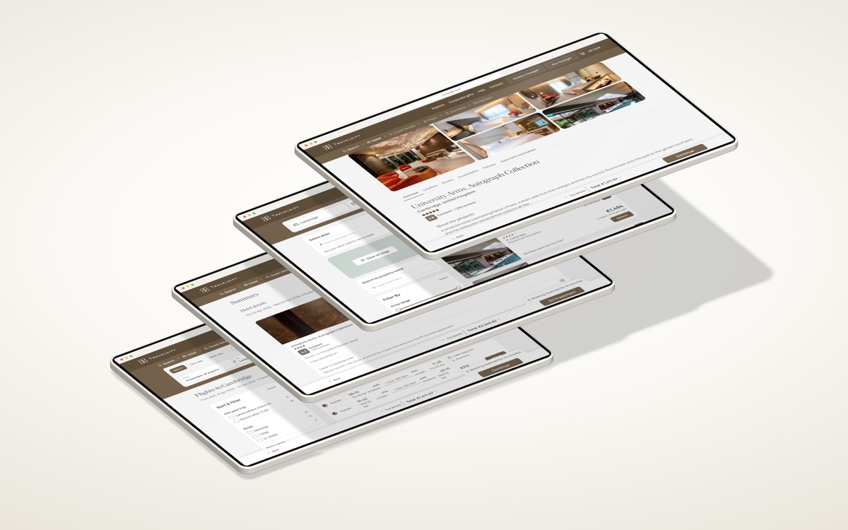
The redemption experience was particularly challenging because it introduced something new to the Experiencegift family: the ability to choose between redeeming a hotel stay or combining a hotel and flight in one booking journey. We needed to make these options feel intuitive while maintaining a seamless, consistent experience across the product.


Beyond buying and redeeming
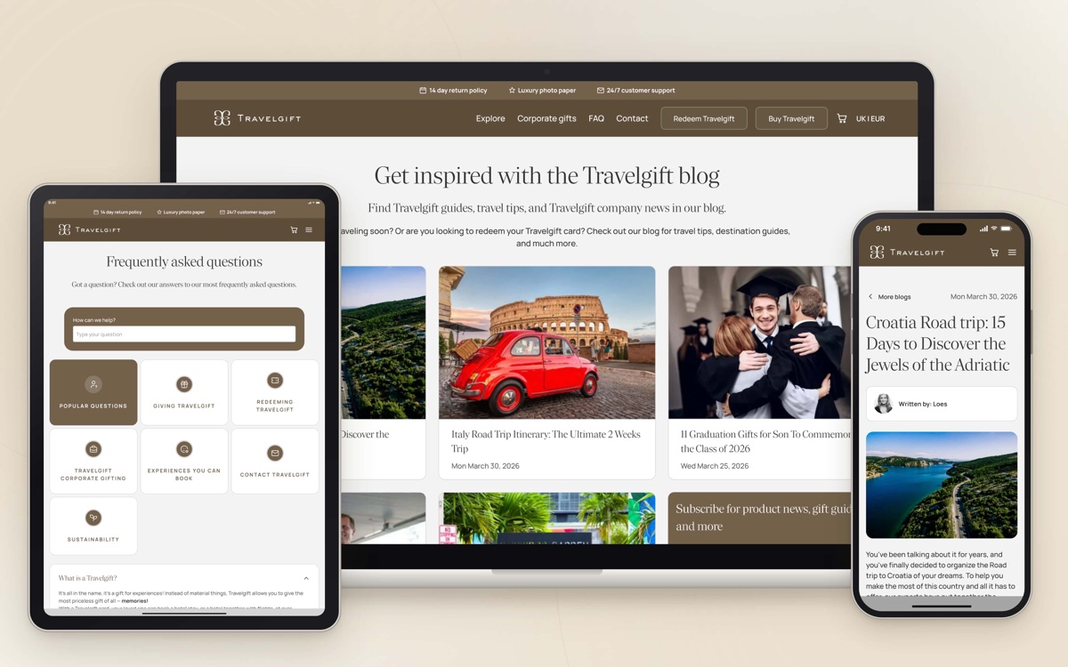
Beyond the core purchase and redemption journeys, we extended the experience across the wider customer journey. This included introducing a new set of email templates, collaborating with the content team on copy and visual assets, and creating marketing pages and blog content to support the launch.

Finding the right colour palette
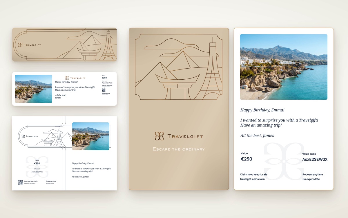
One of the main challenges was translating the physical gift card's visual identity into a digital colour palette. The card features a beige surface with copper outlines, creating a distinctive, premium look. However, beige tones can be difficult to use effectively in digital interfaces, where contrast, readability, and visual hierarchy are essential.
We explored multiple colour variations to find a balance between the physical product and the digital experience. Following the visual language of other Experiencegift products, we chose dark beige and a lighter complementary shade as our primary and secondary colours. This helped Travelgift maintain a recognisable identity while feeling cohesive with the wider brand family.

Outcome
We created a new gifting experience that feels distinctive while remaining connected to the established Experiencegift brand. From personalised gift cards to marketing touchpoints and redemption journeys, the product offers a consistent experience across the customer journey.
The project began in early autumn 2026, with the goal of launching before the Christmas gifting season — one of the most important periods for the business. Close collaboration across design, content, marketing, and development was essential to bring the new product experience together within a demanding timeline.